Dear friends,
In this week’s newsletter, I reveal the cover of my upcoming book, NOTICE Journal, Volume One, share the preorder date how you can help me make the book a success. I also explain how I picked my printer.
Plus, I take a look into my archive for the Process x Excire Giveaway in the latest entry in the Memory Retrieved column.
Housekeeping
Process Photo Walks — Join me in the coming weeks for photo walks in Madrid (Oct 6), Paris (Nov 10), and London (Nov 16). Make sure to RSVP to reserve your spot. These are free walks.
New Photo Essay — A new photo essay featuring some of my Tuscany work was recently published in the publication Imprint, published by the G5A Foundation. You can find the online version here.
Revealing the NOTICE Journal Cover + Why
Last week, I shared how to crystallize your vision for a book cover and write a design brief that helps your designer bring it to life. This week, I’m excited to reveal the result of months of collaboration with brilliant designer Maxwell George, where we carefully refined every detail, including insights from Dan Rubin.
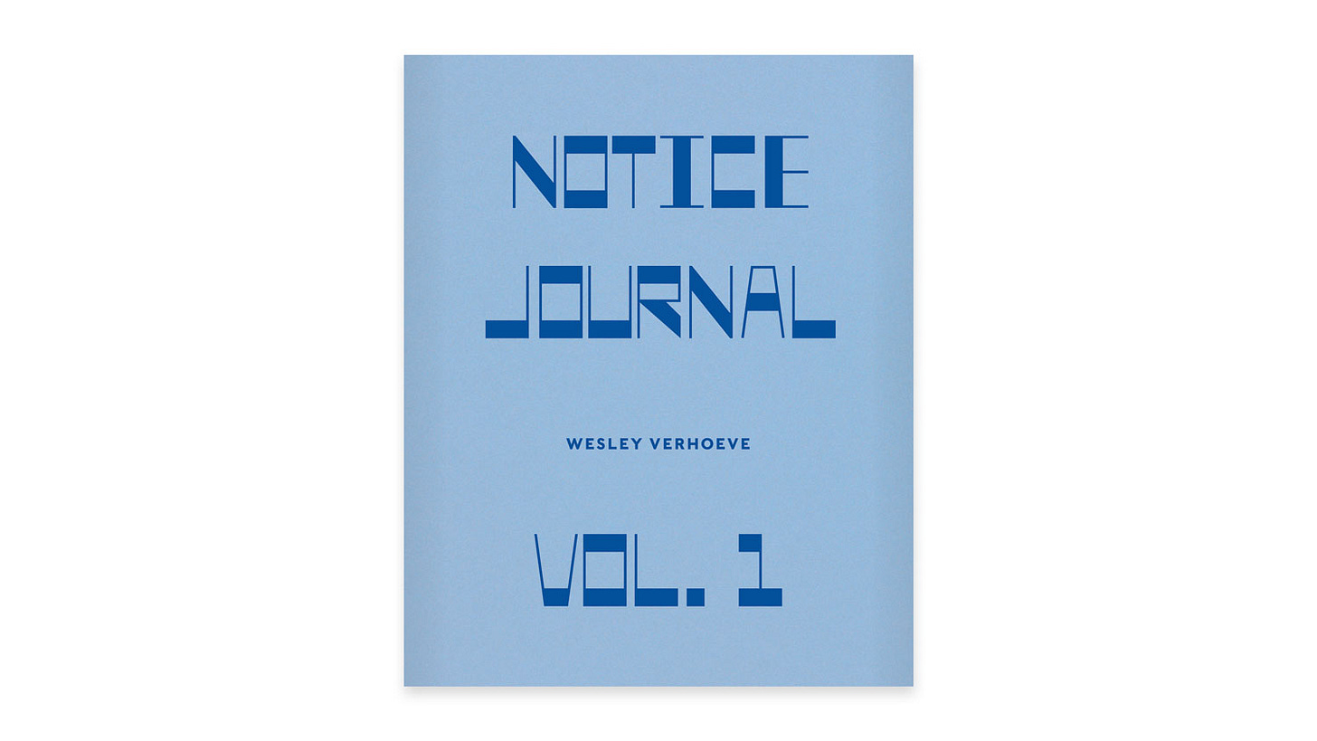
Without further ado, the cover of my upcoming book NOTICE Journal, Volume One:
I'm really excited about the cover design and excited to share some of the choices that went into creating it in this week’s issue. Let’s go!
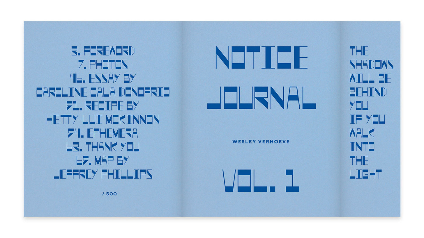
First up, the cover is wrapped in a light blue, textured material that carries a lot of meaning. It’s a color that reminds me of the blue skies that emerge when spring finally arrives in Amsterdam after the long, grey winter. The feeling of coming out of darkness into the light is at the heart of this body of work. The book’s subtitle after all is "The Shadows Will Be Behind You If You Walk Into The Light". Speaking of the subtitle, it’s printed cheekily on the gatefold flap on the inside of the cover, see below.
The photos in this book were shot over three seasons of spring in Amsterdam, during a time when I was moving out of a metaphorical winter of my own. That blue speaks to the feeling of hope and renewal at the end of a period of processing and growth.
The custom typeface you’ll see on both the cover and back was hand-drawn by Maxwell. The design draws inspiration from the Amsterdam School of Architecture and design from the early 20th century, which I came across during my photo walks in the city's older neighborhoods. The movement's influence shows up in the photos through architecture, so it felt natural to include it in the typography.
Cover Material, Interior Paper, and Binding
The material for the cover is a heavy, textured paper made by Fedrigoni, a 140-year-old company in Italy. It has a weight and sturdiness that feel right for this project. For the interior paper, I did have to deal with a last-minute change.
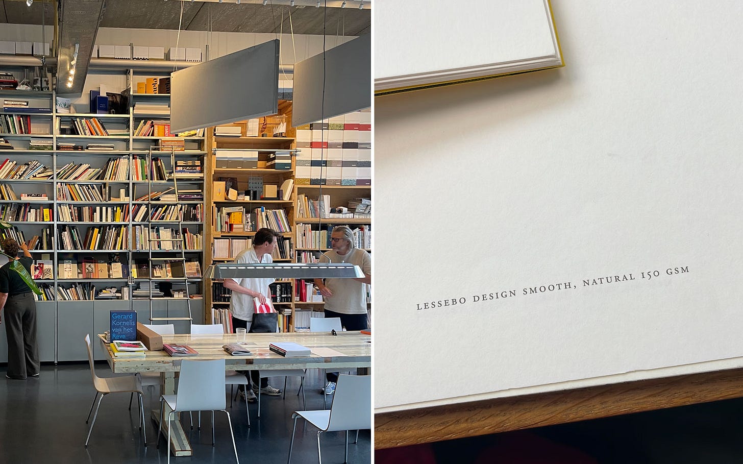
It turns out that the original interior paper I had selected was recently discontinued, but with the help of the team at RobStolk, the printer, I found a beautiful uncoated alternative that has a lovely organic color and texture. It’s made by Lessebo, a 300 year old company from Sweden. It’s ever so slightly off-white, which lets the images breathe and gives them a warmth that complements the overall mood of the book.
The book is bound using a cahier stitch, which means the stitching is visible both inside and outside the cover. It gives the book that handmade, journal-like quality I was after. It feels like something you’ll want to hold, flip through, and keep on your shelf for a long time. I am particularly thrilled about this part of the binding!
Inspiration from the Past
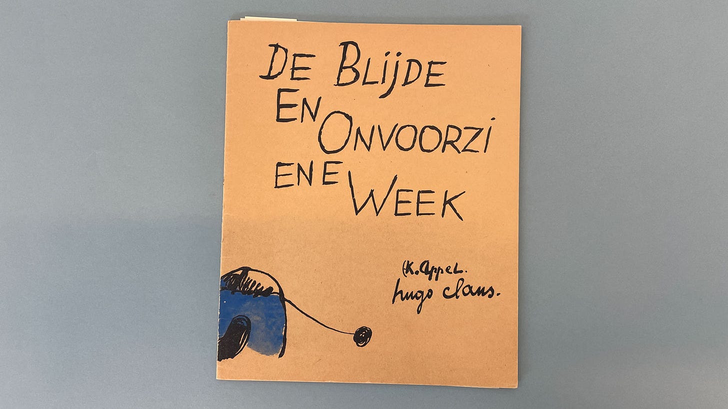
For the overall look and feel of the book, I wanted it to nod to the independent art journals of the 1930s, '40s, and '50s. Think of pamphlets like "De Blijde en Onvoorziene Week" by Karel Appel and Hugo Claus—small-scale, intimate publications that feel like they could have been made by hand. (See below)
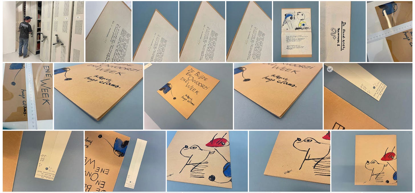
I was lucky enough to view one of the few surviving copies of this particular journal at the Stedelijk Museum, thanks to two kind archivists who guided me through the depot. Below is a selection of research photos I took at the depot during my inspiring visit. More than anything, I wanted to capture that spirit of artistry and attention to detail in the NOTICE Journal series.
Choosing My Printer
When it came to choosing a printer for this project, I decided very early on to approach the Amsterdam-based company RobStolk. This was a shift from my last book, NOTICE, which was printed by Wilco. They did an excellent job, but I felt they wouldn’t be the right fit for this particular book.
RobStolk has been an incredible partner in the process of creating NOTICE Journal, Volume One. They’ve printed some of my favorite photo books in recent years, and I’d go so far as to say they’re the best art book printer in all of Europe. Their commitment to excellence has shown in every step so far, especially during the brainstorming session when they brought in different paper samples based on their experience and what they knew about the work in this book.
I’m excited to bring you along for the printing and binding process in November. The team at RobStolk will allow me to record video of every step of the way so expect another YouTube video similar to when we printed NOTICE in 2012.
Making This Book Possible, Preorder, Print Run, and Timing
Let’s talk logistics. Preorders for NOTICE Journal, Volume One will go live on soon:
NJV1 — Preorder Launch: October 20th.
Unlike my previous book, NOTICE, which had a print run of 1,000 copies (now in its second printing of an additional 1,000), this new book will be released in a limited edition. Only 500 copies will be made, including a small run of about special editions. This decision was intentional—I wanted this project to feel more intimate, more handmade. Each book will be numbered and signed.
With your support, this is just the beginning of what I hope will become a long-running series. The plan is to release at least one volume of the NOTICE Journal series every year, each exploring a new theme. While the photographs inside and the cover design and color will change, the format and size will stay the same, creating a cohesive library that I think you’ll enjoy building over time. If you’re like me, a bit of a collector, you’ll appreciate the consistency in design across the series.
I want these journals to be little meditative moments in your day, something to slow down with. And, perhaps, a reminder that we can use photography as a way to process and document the events in our lives.
Mark October 20th on your calendars and get ready to preorder. I can’t wait for this book to find its way into your hands and your homes all over the world. <3
How To Make A Book — In 15 Steps
In case you’re new here, I’ve included all previous steps below.
Step 1 ☼ Finding The Right Concept to Build a Book Around
Step 2 ☼ How To Select and Organize Your Images
Step 3 ☼ How To Sequence Your Images and Build a Narrative
Step 4 ☼ Designing A Layout (As A Non-Designer)
Step 5 + 6 ☼ How To Make A Photo Book Dummy + Revise/Edit
Step 7 ☼ How To Write and Use Text In Your Photo Book or Zine
Step 8 ☼ How To Make Smart Design Choices For Your Photo Book
Step 9 ☼ How To Design A Book Cover
Step 10 ☼ Choosing your printer and your materials
Upcoming Steps:
Step 11 — How to talk about and market your book
Step 12 — How to launch a preorder
Step 13 — Press coverage and partnerships
Step 14 — How to launch your photo book
Thank you for reading. Process is the result of collaborative creativity. It’s written by me and supported by you—whether you read, share, comment, buy my books, hire me for portraits or mentoring, or become a paid subscriber:
NEXT WEEK: How to talk about your book, and I ask for your help to get NOTICE Journal out there into the world.
Keep shooting and take good care of yourselves and others. <3
Wesley
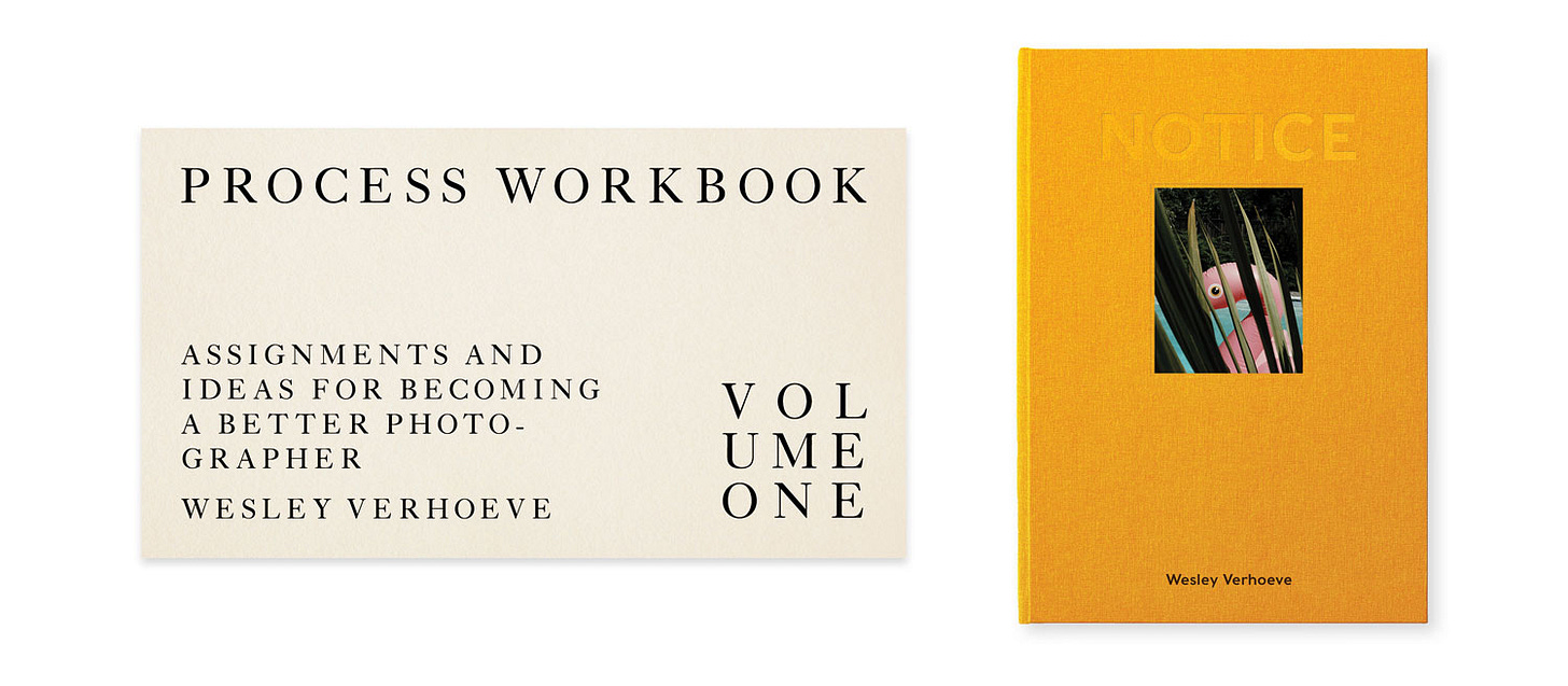
PS If you’d like to support what I do here, consider ordering the brand new Process Work Book (free for members, €8.99 for non-members) and my photo book "NOTICE" (€39 for members with use of their Process Photo Club coupon, €69 for non-members).
Gear & Tools Used
Camera: iPhone 12, Pentax LX
Film Stock: Double X
Shout out to MPB.com, my go-to place to buy, sell, and trade used cameras and lenses. I love their service and am a paying customer. MPB caters to over 625,000 visual storytellers and provides a 6-month warranty. Thanks for the support, MPB! <3
Lab: All my analog work is developed and scanned by my friends at Carmencita Film Lab. They’re my favorite lab in the world. Use code “PROCESS” to get a free upgrade.
Memory Retrieved — A Process Giveaway
For a six month period, I’ll explore my 20-year archive once a month, using Excire to search based on a keyword suggested by a Process reader. This month, I chose "empathy," a suggestion from reader (and friend) Minnow Park in the comments of Process 157. While there were many excellent suggestions, this one intrigued me the most because of its nuanced and emotional nature.
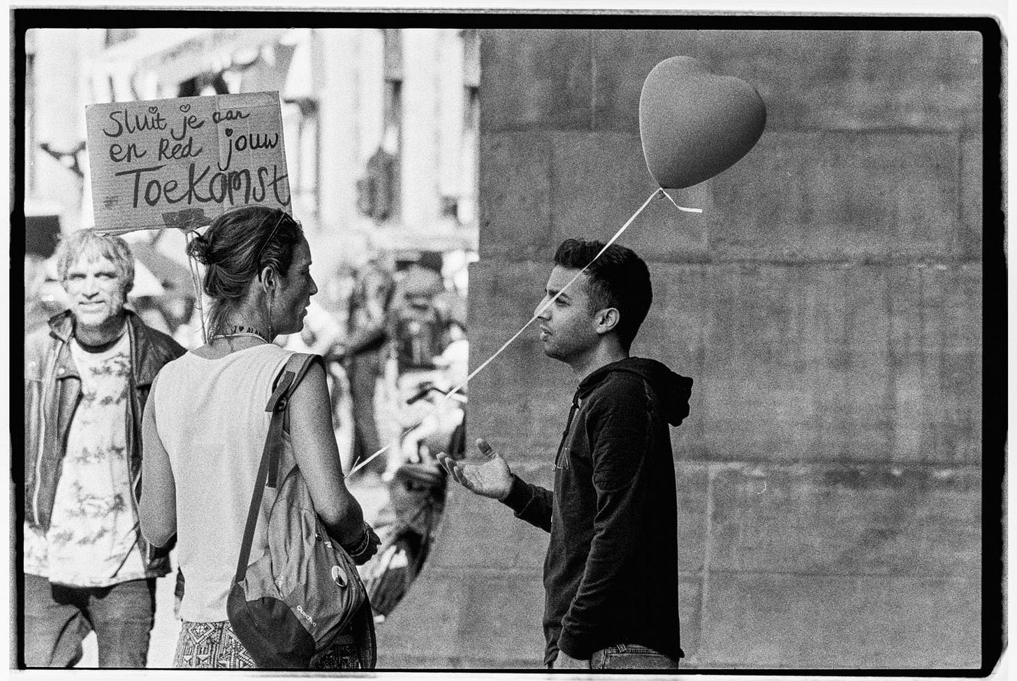
The search pulled up 502 images, many featuring mothers with children and people with dogs. However, the most intriguing result was this shot I took at a protest march in 2021.
I totally forgot about this picture and have never published it anywhere before, so this was a really fun way to be reminded of it. Congrats to Minnow, who wins a free copy of Excire!
Which keyword should I search for next month?
Suggest a keyword in the comments, and I’ll randomly select a winner to receive a free copy of Excire. Excire is a software service that uses AI to analyze and tag your photos, making it easy to search and find images using keywords. Note: Excire does not use any of our images for training purposes or other activities. They remain on your computer only.
Check out Excire here. Process readers receive 15% off with the coupon code "PROCESS" at checkout. Highly recommended.
Can’t get enough Process? Browse the Process Archives.
Visit the Process Photo Club members area for perks and more.



Your design..but I strained to read it…
This is such a beautiful design. And I find the whole series to be an inspiration.