This issue is Step 4 of a 10-part series guiding you through the step-by-step process of making your very own book or zine. Join me as I share my firsthand experience creating "NOTICE Journal, Volume One", and get inspired to work on your own project.
Dear friends,
In this week's letter, step four in making my new book NOTICE Journal, Volume One: Choosing a layout design that complements the photographs in your zine or book.
Thank you for those of you who have been spreading the word about this series and helping me reach more people. I really appreciate it. Hit that 🔄 symbol at the start of the issue to send it to your Substack network or share it on social media. <3
Curious about the previous steps? You can check them out here:
Step 1 — Finding The Right Concept to Build a Book Around
Step 2 — How To Select and Organize Your Images
Step 3 — How To Sequence Your Images and Build a Narrative
Housekeeping
Next Process Photo Walk — Antwerp, Saturday, May 18th. RSVP here. Co-organized by Jason Kravitz and the Aminus3 photography community. Join us!
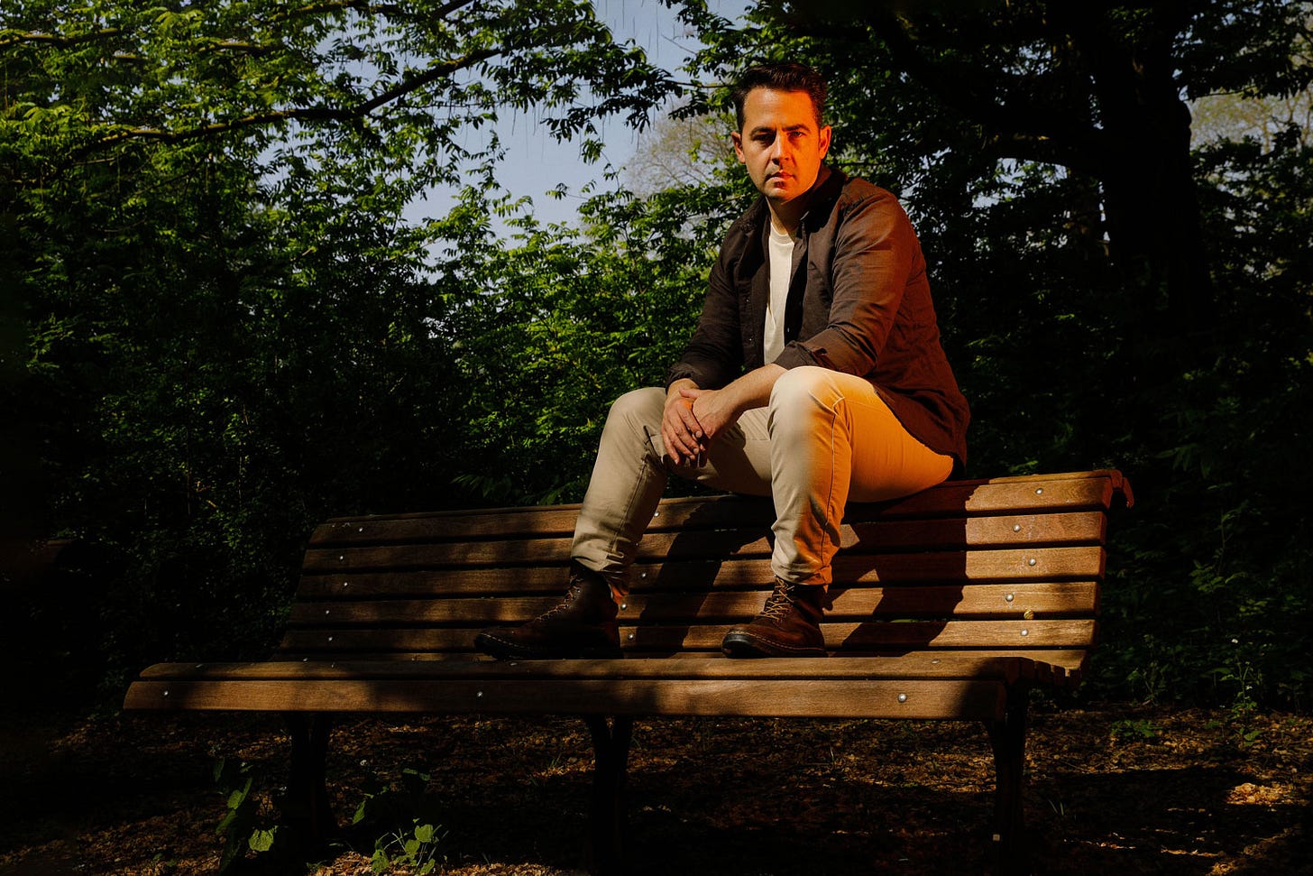
I’m Available for Portrait Sessions for May/June — I still have a few slots open for portrait shoots for creatives, entrepreneurs, and anyone else who needs a refresh on their visual identity. Here’s photo and a testimonial from one of my favorite shoots of last week:
The cover image sent my partner and I to outer space. We're sitting here with so much gratitude for how you were able to see me. This is a gift I will remember for my entire life, for sure. It was so much fun and you made it feel very easy. There were so many good ones, it was hard to choose. — Van Miranda, poet and musician
Step 4 — Designing A Layout (As A Non-Designer)
So far we’ve decided on the following aspects for our book: the theme, which images align with the theme, and a great sequence that create an engaging narrative. This week, we'll dig into the surprisingly intriguing and super important step of designing a layout for your photo book or zine.
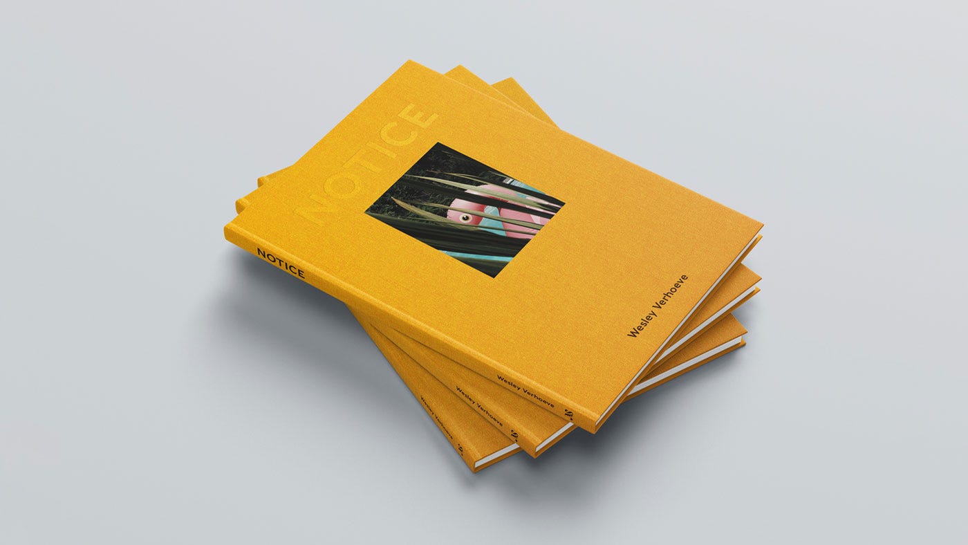
While I am not a designer myself—and design is indeed an art form in its own right—I've had the privilege of collaborating with many talented designers over the years, including designer and photographer Dan Rubin who designed my book NOTICE. Today, I'll share some valuable lessons that I've learned about designing layouts .
A well-executed layout can transform your work from plain to great, elevating your photographs and leaving a lasting impression on the reader. There are so many ways to lay out a book. Too many to go through, but let’s start with some examples. First up, the classic William Eggleston book "Guide", which features his groundbreaking early color work. It was the first one-man show of color photographs ever presented at The Museum of Modern Art in New York City.
The video above showcases 35mm work, all in a 2x3 ratio, where images float within white space, varying in their placement. Sometimes, an image is centered at the top, while other times it's positioned in the middle or at the bottom. My interpretation is that this dynamic layout mirrors Eggleston's approach to finding beauty in the ordinary, inviting readers on a visual hunt that reflects the artist's creative process.
For a very different choice we go to Daido Moriyama's "Labyrinth", which is a unique exploration of chaos and energy, achieved by eliminating white space and showcasing countless contact sheets printed in full bleed. This style brings us into the frenetic pace and somewhat overwhelming atmosphere of a career spanning 50 years.
Designing The Layout of the Notice Journal Series
For my upcoming "NOTICE Journal" series, I've faced the challenge of designing a layout that not only serves "Volume One" but also provides a solid foundation for future editions. My goal is to create a cohesive visual language that, when the books line up on a shelf, screams, "We belong together!"
"Volume One" is made up exclusively of half-frame images in the 2x3 ratio, while future volumes will explore a variety of formats—from 6x6 to 6x7 and 6x4.5. With the help of my friend and designer, Jeroen Pruijts, we found an elegant solution: the "NOTICE Journal" series will exist as a 21x26cm book size that gives all these formats a suitable and versatile home. (Below some sketches of 2x3 and 6x6 to give you an idea.)
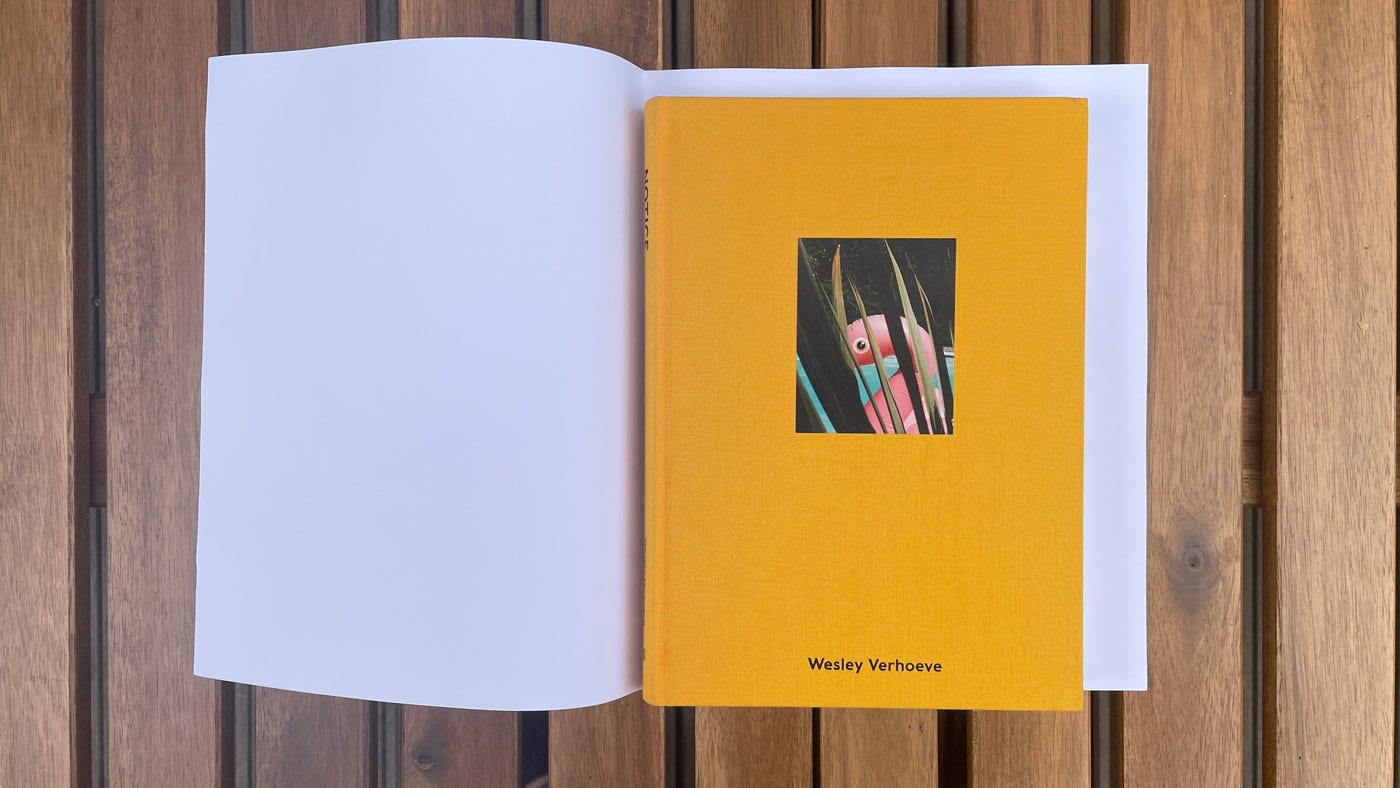
To show you the difference between the size and ratio of my previous book "NOTICE" and the upcoming "NOTICE Journal" series I have place the former on top of a blank dummy of the latter. See below. It’s a bit taller and wider.
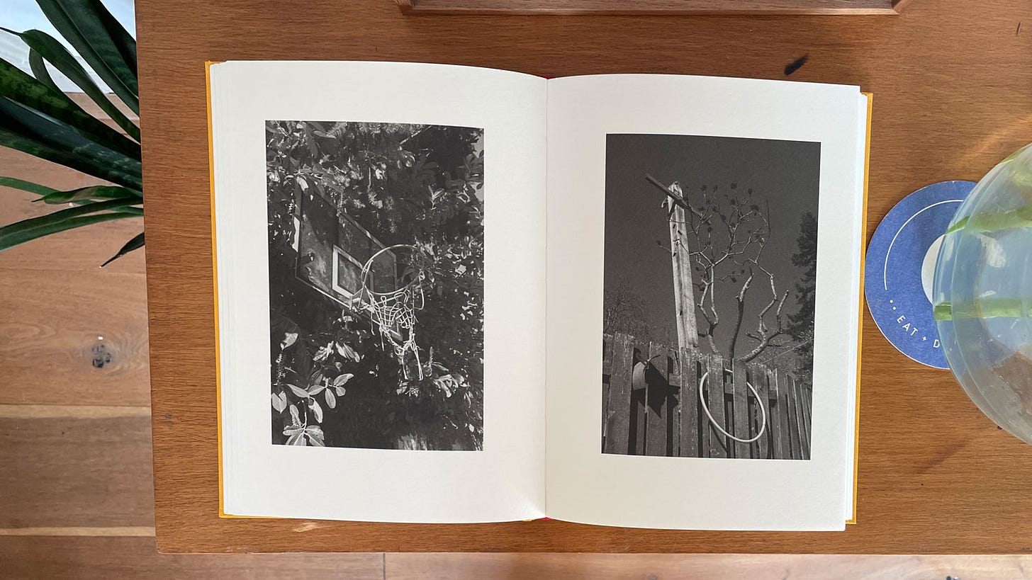
Now that we know the size and the ratio of "NJV1", we can move on to how the images will be laid out on the page. In my previous book, "NOTICE", designer Dan Rubin and I opted for a simple, meditative pulse-style layout. Think of it as a calm and steady heartbeat, each page features one image, consistently positioned. This design choice aimed to evoke in the viewer the same emotions I experienced during the months I spent walking and noticing while shooting this body of work.
As a reminder, this body of work was created during the initial months of the pandemic, when I found myself stuck in a quiet Vancouver suburb. Developing a daily routine centered around these photo walks became essential in maintaining a sense of normalcy during the unprecedented and scary events around the world. In a way, this creative process served as a photographic meditation.
Making this work brought me a consistent feeling of calmness and curiosity. For 123 consecutive days I focused on slowing down and noticing small pockets of beauty, wonder, and humor in my quiet neighborhood. Each photo walk left me feeling a deeper connection to my physical surroundings and a greatest sense of grounding as a person. I wanted the layout and design of the book to reflect and transmit this feeling to the readers.
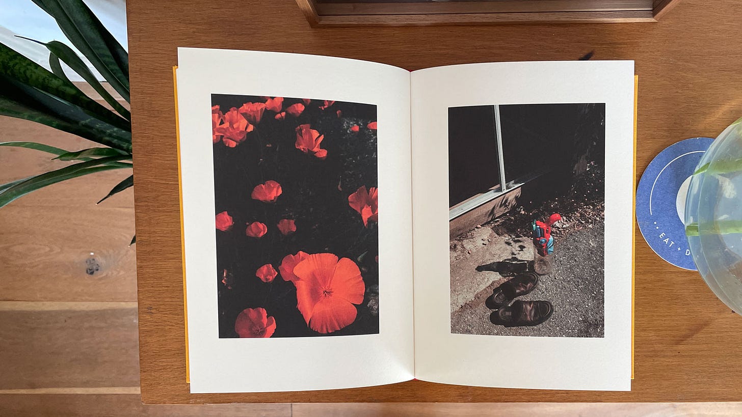
The white space is designed to give the pictures breathing space and a balanced home on the page. The pace of one picture per page in the same spot is designed to stimulate the feeling of the meditative rhythm of a consistent heart beat. The left-page/right-page pairings are designed to highlight that when we slow down and pay attention we can find not only beauty around us, but echoing patterns of beauty.
My favorite feedback about "NOTICE" has been when people tell me that they regularly take some time to sit down with the book and relax while browsing through its pages. What's even more amazing is that others have been encouraged to explore their own neighborhoods and find the hidden beauty in the everyday things around them. I was able to pass on what I got to feel, which is all I could ever hope for.
Naturally, "NJV1" shares a similar underlying philosophy with "NOTICE," emphasizing the importance of slowing down and appreciating the beauty in our everyday surroundings. The biggest difference is the equipment used: a half-frame camera. As a result, the pairing of images occurs in-camera instead of during the sequencing process. Rather than splitting them up, we will see two images, or one negative, presented together on a single page, mirroring the arrangement found in the original negative. They will be presented with lots of white space, and once again located in the same spot on every page, to give us that feeling of a calm rhythm.
As I work to complete "NOTICE Journal Volume One" (or "NJV1"), I've been taking my time to get everything just right. After all, it sets the tone for the entire series—photographically, design-wise, binding, and everything in between. This process demands patience and dedication, but I know the payoff will be worth it. Having control over every aspect of a book is so satisfying, and it’s something I’m grateful for.
I hope this issue has provided some insight into designing layouts for your personal zine, book project, or online portfolio. If you have the opportunity to collaborate with a designer, I highly encourage you to do so. Regardless, I hope that this issue has offered a common language to make working with a designer in the future easier.
Takeaway
Remember that images can be placed literally anywhere on the page. They don’t have to be centered in the middle and they don’t have to fill the page. Images can be consistently placed in one place, or dynamically change with every page. Images can be situated near the top with white space below or float at the bottom underneath a sky of white space. Placement can create a calm feeling or tension. It can ground the viewer’s attention or build suspense. It’s all about which story you’re trying to tell, and what serves that story best. Being thoughtful about this goes a long way.
White space effectively creates an atmosphere of reverence and provides breathing room, while a full-bleed page captivates the reader, drawing them deeper into the narrative. An image spread across two pages invites readers to delve into every intricate detail, making an even more immersive experience. The possibilities are endless, which is also why this part of the book making process is so challenging but oh so satisfying when you find the right solution.
Upcoming Steps
Over the next period, I will share each step of making "NJV1," diving into the finer details and the overarching vision so you can see the entire process. Up next:
Step 5 — Create A Dummy
Step 6 — Edit and Revise
Step 7 — Write and Refine Text
Step 8 — Finalize Design
Step 9 — Choose Your Printer
Step 10 — Market and Launch Your Book
Past Steps
Step 1 — Finding The Right Concept to Build a Book Around
Step 2 — How To Select and Organize Your Images
Step 3 — How To Sequence Your Images and Build a Narrative
Step 4 — How To Decide On a Layout Design
If you enjoyed this issue I’d love for you to share it with friends. Re-stacks help a lot! It’s that little 🔄 symbol at the start of the issue.
Next Week: A one-week break from the book-making process to look back at the Process Photo Walk in Amsterdam on May 5th.
Keep shooting and take good care of yourselves and others. <3
Wesley
PS Would you like to support Process? Please order my photo book NOTICE. <3
Gear & Tools Used
Camera: BTS images shot on my Fujifilm X100F. Images for NJV1 are shot on the Olympus Pen-F. Images for NOTICE were shot on a variety of cameras including the Pentax LX, Pentax 67ii, Fujifilm X100F, and the Canon 5D Mark IV.
Film Stocks: Kodak Portra, Kodak Tri-X, Ilford Delta 400.
Shout out to MPB.com, my go-to place to buy, sell, and trade used cameras and lenses. I love their service and am a paying customer. MPB caters to over 625,000 visual storytellers and provides a 6-month warranty. Thanks for the support, MPB! <3
Lab: All my analog work is developed and scanned by my friends at Carmencita Film Lab. They’re my favorite lab in the world. Use code “PROCESS” to get a free upgrade.





Another great post.
I do think photographers can be good designers.
They work with frames, edges, white space, leading lines, color design... a lot of the same things that designers work with.
Typography needs to be studied a bit, of course.
The book is coming along nicely.
Love this series.
Superb advice and post.