148 ☼ How To Make Smart Design Choices For Your Photo Book
HUGE Process Movie Screening News + Moment Giveaway
Dear friends,
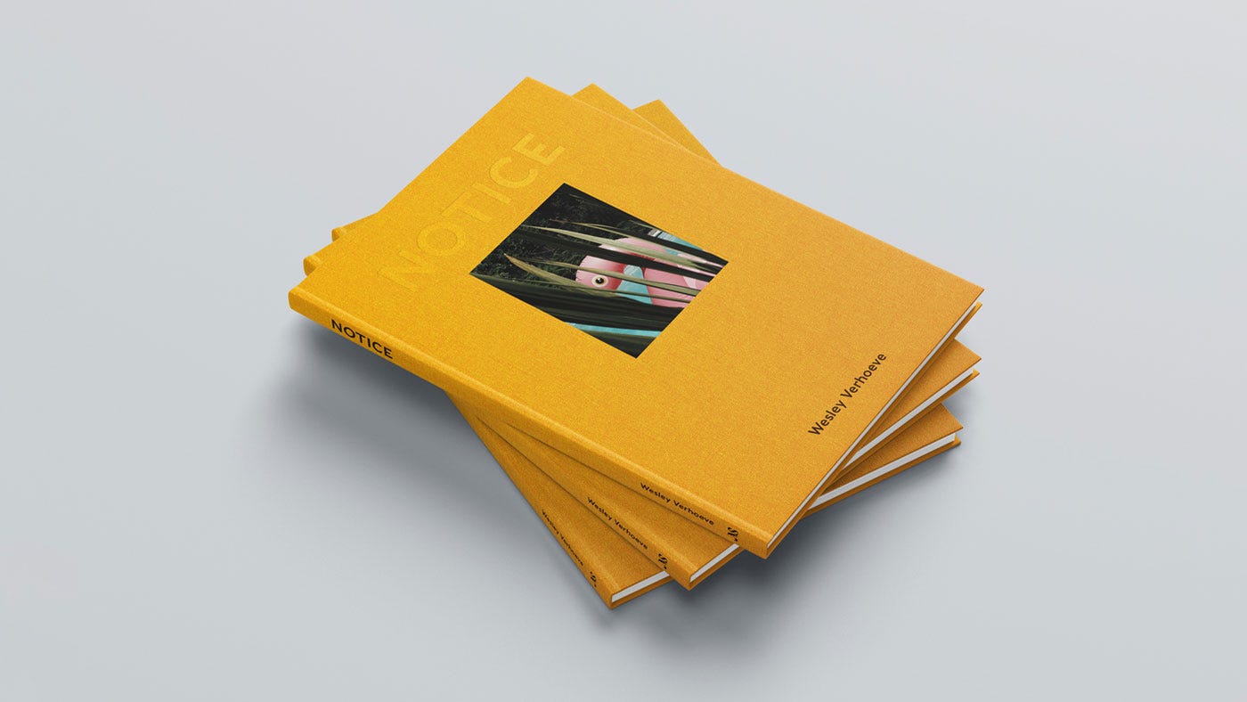
In this week's letter, step seven in making my new book NOTICE Journal, Volume One: Making design choices that increase the power of your photos. Also, some nerdy design thinking about what is at the foundation of design choices as a functional contributor to the quality of a photo book. Strap in!
Also in this issue: a fantastic Process Giveaway with my friends at Moment who made available a $150 gift certificate to their online photography shop.
Process Movie Screening News!
Process Movie Screening Added! — Amsterdam, Saturday, July 21st. Don't miss the upcoming Amsterdam Photo Walk, featuring the Dutch premiere of "Uncropped"—a documentary on legendary NYC culture photographer James Hamilton, produced by Wes Anderson. Limited spots are available, so RSVP here now to secure your place. The walk is already 80% full! Watch the trailer below.
Thoughts on the Foundation of Design Choices
In the process of finalizing the design for my latest book, "NOTICE Journal — Volume One" ("NJV1"), I've been taking my time to consider the impact and effect I hope this series will have. With every decision, I go back to the theme of the book. Not only to make sure I strongly support this theme at every step, but also because fewer options mean less to think about. As a reminder, the theme of the NOTICE Journal series was established in Process 140:
The common thread in this series is the intentional practice of noticing beauty and wonder in all its varied forms. Beauty is everywhere and not hard to find, but it can easily be overlooked if we don’t decide to slow down and notice.
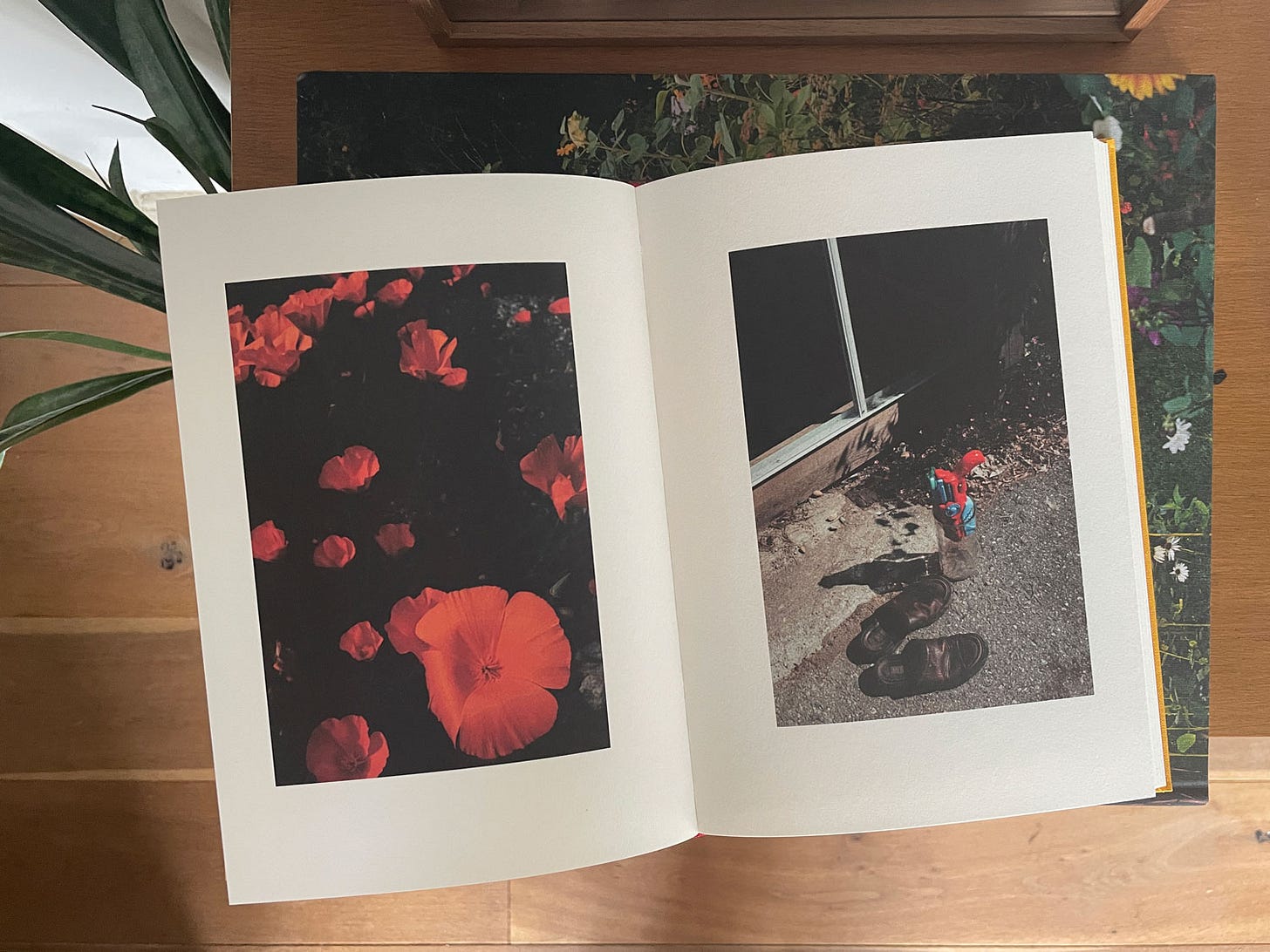
In other words, curiosity and the discovery of beauty in overlooked places are central themes I want to put forward to the reader, not only through the photographs but also through the design and material choices.
Thankfully, I am working on the interior with a brilliant and thoughtful designer, Dan Rubin, who can put these form and function thoughts into practice. Designing "NJV1" involves thoughtful decisions about image placement, the number of images per page, and the use of white space all with the theme in mind. Let me bring you along for some of these choices.
With my previous book "NOTICE," the layout and rhythm were deliberately simple and repetitive, with the same orientation on each page, to create a consistent, meditative feeling for the reader. This design choice served as a metaphor for the 123 consecutive days of photo walks while making the work. Same time, every day, a grounding, meditative, photo walk to establish a routine during these wide-open days.
This design choice worked out well, judging by the wonderful feedback I received from readers who were inspired to get out and find hidden beauty in their towns. Knowing that this process has brought them calmness, consolation, and joy has been truly gratifying and exactly what I hope to achieve.
With "NJV1," we're taking a different approach. Below are some notes, excuse the poor handwriting, from my first Zoom design meeting with Dan a few weeks ago.
By the end of the meeting, we realized that "playful" and "jazz" were the keywords we kept returning to for our design and layout. Rather than a more traditional meditative pace, we realized that with "NJV1" we can lean into exactly the playfulness I was able to put into the photographs in this body of work.
Where "NOTICE" was created during the pandemic and therefore exists in a world of quiet and solitude, "NJV1" represents a period of big changes in my life including a joyful rebirth. All the photos were shot during two spring seasons, perhaps the most playful of the four seasons.
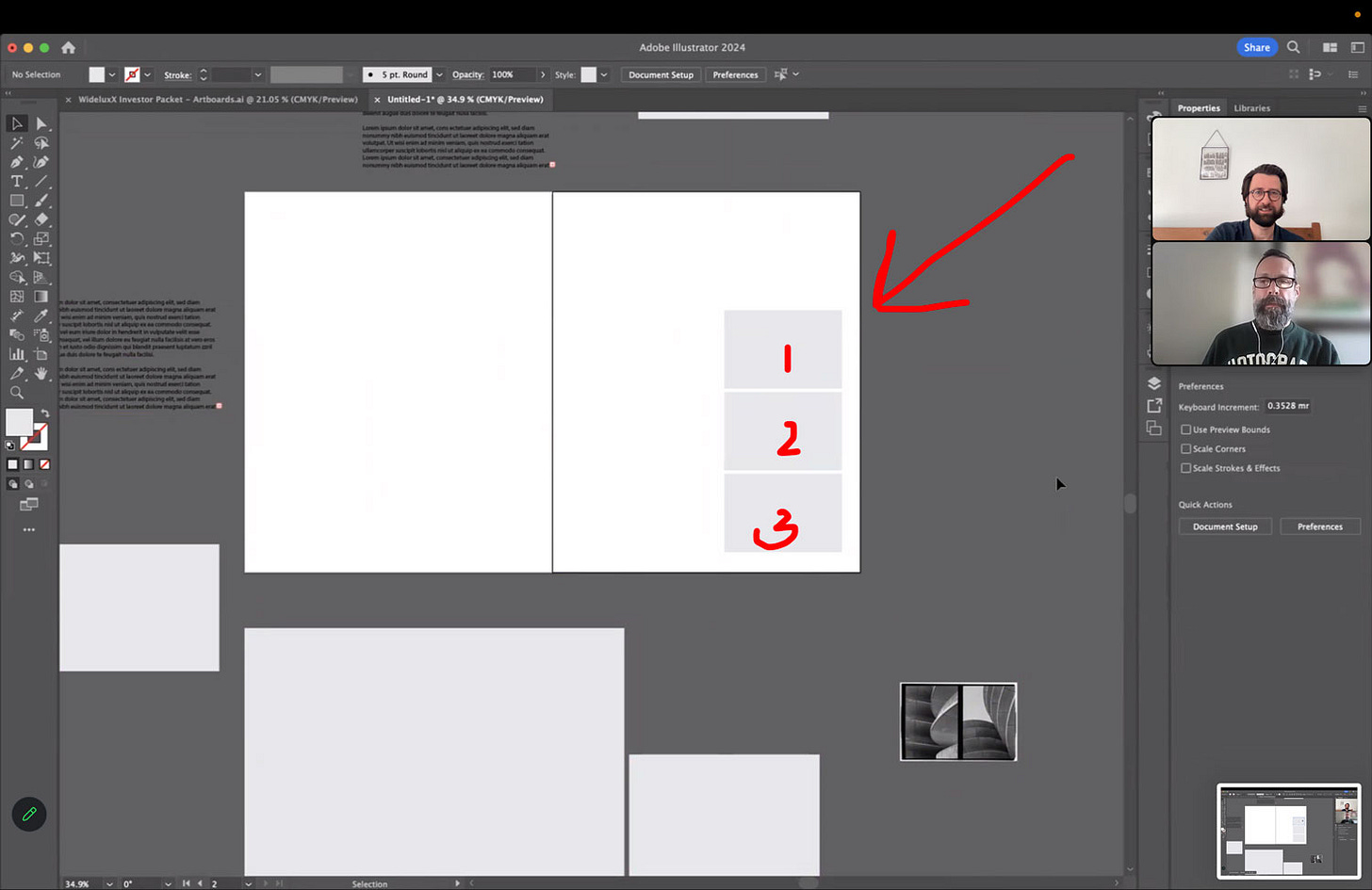
Considering this, Dan and I have been brainstorming ways to embody the essence of playfulness and the spirit of early 1960’s jazz within a fine art book. Inspired by the fundamentals of the Bauhaus movement1, we are pushing boundaries while maintaining strong object relationships. Objects in this case refer to the photographs, text, and the book itself. For example, we decided that the photographs will appear in the book in one of three sizes only. (see below)
In the screenshot above, you’ll notice my crude illustrations of each of the three image sizes. (See red numbers.) The width of size one matches the height of a book page, creating a harmonious relationship between image and book. Dan, being more knowledgeable about design principles, pointed out that we're essentially applying the age-old golden ratio to our image sizes. While the reader may not need to know this, it provides a sense of order that our brains naturally appreciate between images, text, and the book.
Speaking of text and playfulness, we even decided to stay away from a traditional way of laying out the text from the essay and use the same shapes as we will for the pictures instead. This means the text will be spread over more pages in the end. Below is an ipsum lorem example of part of the essay laid out within these constraints.
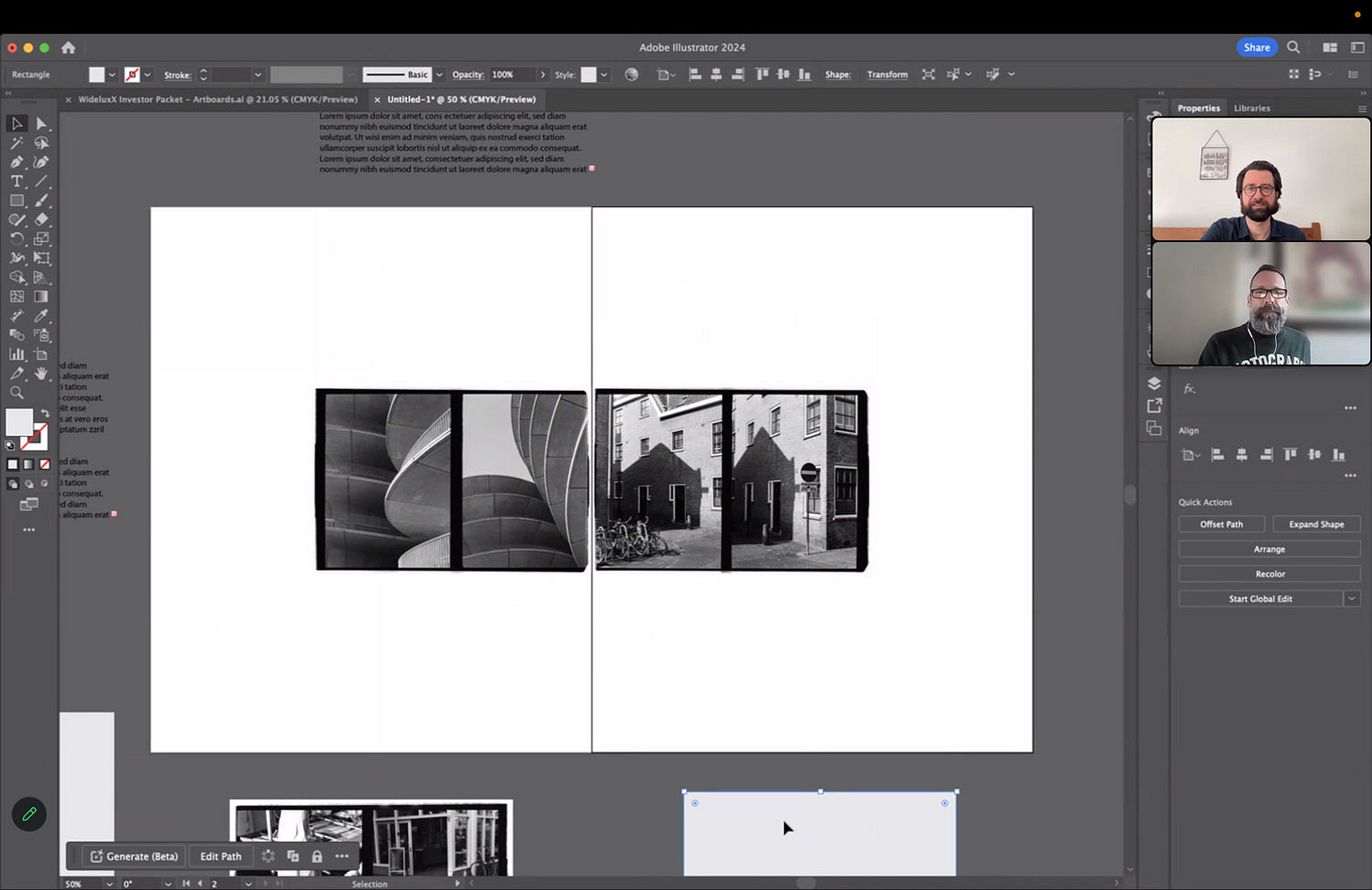
To get back to the images, we're experimenting with using the entire page. Some of the medium-sized images can be placed on separate pages but still connected, effectively turning two diptychs into one set of four images. This creates an almost musical rhythm of notes across a spread. (See below.)
Other times, an image may need to stand completely on its own, and larger, to give the required amount of attention to the finer details of what is going on. (See below.)
This image is so full of detail that you may not even really make it out in this screenshot, but it will sing on the printed page, splitting the diptych over two pages for a double-paged spread.
Other times, we are opting for the smallest of the three sizes, which in print is still plenty big, to imply certain narratives between the different photos. (See below.)
This collaborative process with Dan is such a delightful experience and will lead to a layout that feels dynamic yet harmonious, inviting the reader to explore each page with a sense of discovery that is hopefully similar to mine as I was making the work.
Takeaways
Each design choice plays a small role in a prompt to encourage the reader. Remember that with every choice you make, from the pictures you chose to the sequence, to the design, layout, and materials, you have an opportunity to strengthen your commitment to your theme and the impact you hope to make with your story.
And again, through this book, I hope to foster a sense of curiosity and encourage readers to slow down and observe the world around them. Our design decisions are geared towards making the reading experience as playful and regenerative as the creative journey of making the work itself. I can’t wait for you all to hold this book in your hands and see it for yourself.
Thank you for joining me in all these steps of making my next photo book and for allowing my work to be a part of your own creative exploration. Let’s continue to find and celebrate the hidden beauty in our everyday lives.
Upcoming Steps
We are now more than halfway through the process of making a new book of zine, yet there is still so much fun and interesting stuff to come. I even decided to add some more steps because there are some very exciting things in the works for "NJV1" that I can’t speak on yet but I am bursting and can’t wait to tell y’all about it!
Up next:
Step 9 — Choosing your printer
Step 10 — Marketing your book
Step 11 — How to set up a Preorder
Step 11 — Press coverage and partnerships
Step 12 — How to launch your photo book
Previous Steps:
Step 1 ☼ Finding The Right Concept to Build a Book Around
Step 2 ☼ How To Select and Organize Your Images
Step 3 ☼ How To Sequence Your Images and Build a Narrative
Step 4 ☼ Designing A Layout (As A Non-Designer)
Step 5 + 6 ☼ How To Make A Photo Book Dummy + Revise/Edit
Step 7 ☼ How To Write and Use Text In Your Photo Book or Zine
If you enjoyed this issue I’d love for you to share it with friends. Re-stacks help a lot! It’s that little 🔄 symbol at the start of the issue, or share to social with this button:
Up Next: Instead of the next issue coming on Sunday, just for once it will be out on Monday for an exciting reason. I was invited to be one of the first photographers to test a brand-new Pentax analog camera. New as in newly developed! The official announcement is on Monday, so I’ll showcase some of my work with it then. I teamed up with my friend Luc Satter to create a new Process video about the experience.
Keep shooting and take good care of yourselves and others. <3
Wesley
PS Would you like to support Process? Please order my photo book "NOTICE". <3
Gear & Tools Used
Camera: BTS images shot on my Fujifilm X100F. Images for NJV1 are shot on the Olympus Pen-F. Images for NOTICE were shot on a variety of cameras including the Pentax LX, Pentax 67ii, Fujifilm X100F, and the Canon 5D Mark IV.
Film Stocks: Double X, Kodak Portra, Kodak Tri-X, Ilford Delta 400.
Shout out to MPB.com, my go-to place to buy, sell, and trade used cameras and lenses. I love their service and am a paying customer. MPB caters to over 625,000 visual storytellers and provides a 6-month warranty. Thanks for the support, MPB! <3
Lab: All my analog work is developed and scanned by my friends at Carmencita Film Lab. They’re my favorite lab in the world. Use code “PROCESS” to get a free upgrade.
Process Giveaway
My pals over at Moment are back for a generous giveaway! One winner will receive a $150 gift card to buy whatever you wish including film, bags, a course, and more.
To enter this week’s giveaway answer the following question in the comments:
Q: What is your favorite photography related youtube channel or newsletter? (outside of Process, of course)
ENTER THIS WEEK’S GIVEAWAY before 11 a.m. EST on June 15th.
Check out last week’s comments for inspiration and a bunch of fun and interesting answers from the community.
The winner will be randomly drawn. This giveaway is for Process subscribers only.
Can’t get enough Process? Browse the Process Archives.
Follow me on Instagram and Threads.
Bauhaus graphic design prioritizes function over form, emphasizing simplicity and practicality through clean lines, geometric shapes, and efficient use of typography and space. By adhering to the principle of “form follows function,” Bauhaus designers embraced simplicity, clean lines, and geometric shapes.





Great series. You are extremely generous here.
I am soooo looking forward to the Pentax camera newsletter!! I didn't imagine they were so advanced in the project. Can't wait to see your impressions.