Dear friends,
In this week’s letter, we talk about designing a photo book cover and how to write a design brief for a designer.
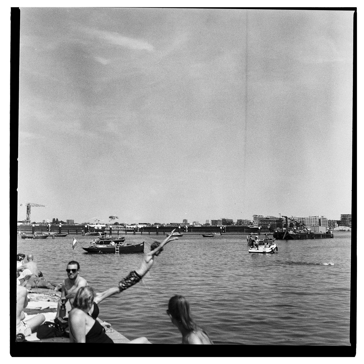
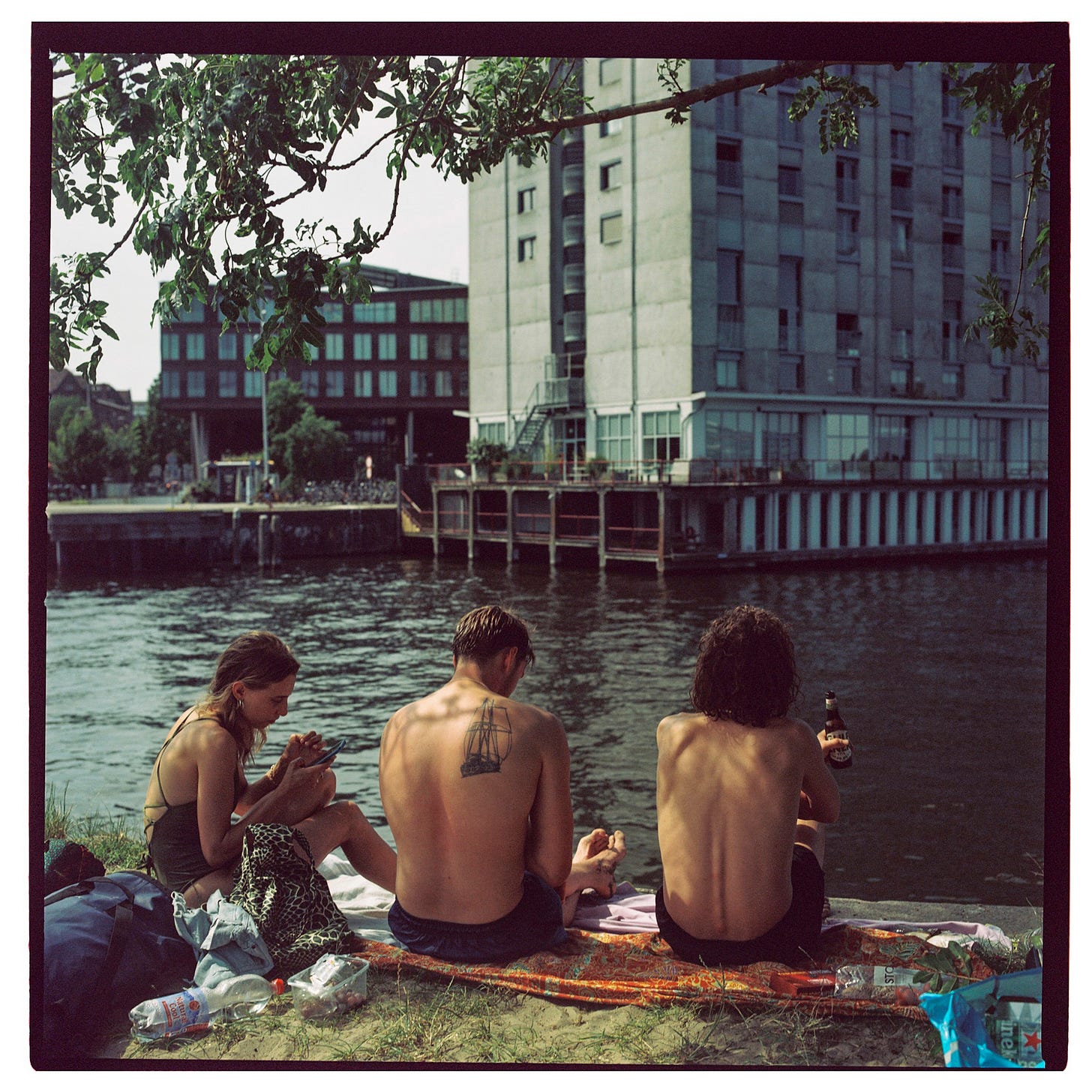
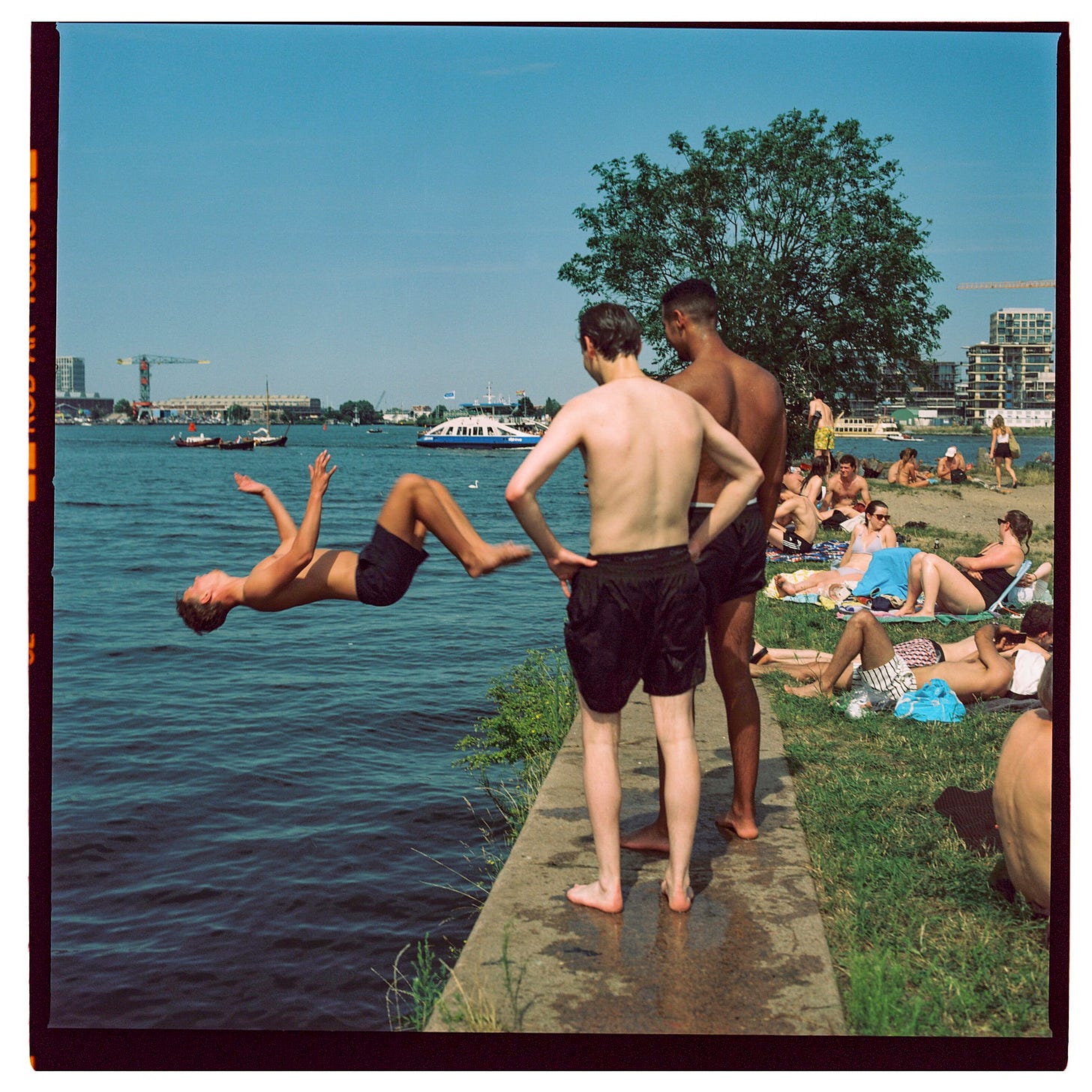
To break up the text, I’ve included a few Hasselblad shots from this past summer in Amsterdam. Like this one.
Housekeeping
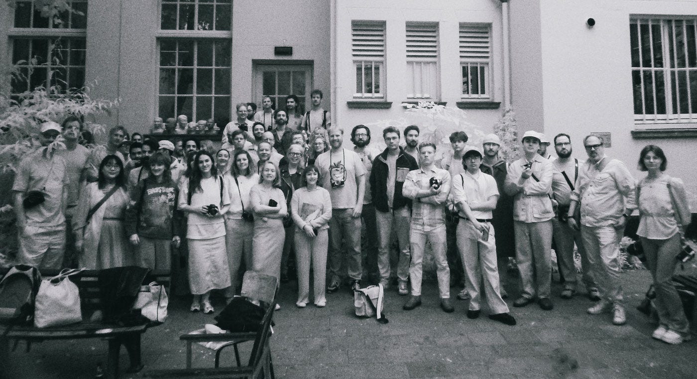
Last week’s Process Photo Walk in Amsterdam was a great success. Our guest, Nora Lalle, editor-in-chief of Pamplemousse Magazine, gave an insightful presentation on what goes into creating a photography magazine. Barry from Analog Club Amsterdam set up a portrait studio at MK24, where everyone had fun taking portraits of each other. We even took a group photo in infrared in the courtyard. It was an all-around fantastic day, and so many people captured amazing shots that I put together a gallery of the day for you here.
How to Write a Clear Brief for Your Designer: Getting Started on Your Photo Book Cover
When you're working on a photo book, the cover is more than just the first thing people see—it's the introduction into the world you've created. A good cover gets noticed and tells a story all on its own, setting the tone before anyone opens the book. And that starts with a strong design brief.
A design brief is your blueprint. It’s a way of giving your designer a clear roadmap for what you’re trying to achieve. I like to think of it like having a conversation in which I get very clear about my artistic vision, our limitations, my inspiration, and any technical information the designer will need.
Since a designer is also an artist and a crafts person, and this is a collaboration, I also want to make sure there is enough space for them to bring their own creativity into the mix. I think of a brief as thoughtful, flexible guidance rather than a strict assignment.
So, what makes a strong brief?
Here are a few things I always include when writing one:
Project Overview – This is where you explain what the project is and what it’s about. It doesn’t have to be long or overly detailed, but it should give your designer an idea of the story you’re trying to tell through the book.
Design Objectives – This section covers the goals for the design. What are you hoping the cover communicates to someone seeing it for the first time? What’s the feeling you want to evoke? Think about adjectives like “bold,” “quiet,” “playful,” or “serious.”
Limitations – Designers need to know if there are any technical or creative limitations they should keep in mind. Maybe there are specific colors or materials you're working with, or a particular printing method. Giving this information up front saves time and helps keep the design process smooth.
Content and Technical Info – This is where you provide practical information about the book’s size, format, or any other specifics about the content that could impact the design. For example, the fact that my photos are presented as diptychs (paired images) is something that matters in how the cover reflects the inside of the book.
A brief doesn't have to be overly formal or rigid. In fact, the best ones feel like a conversation—a chance to get the designer on the same page with you about what you're both trying to create.
For my upcoming book NOTICE Journal, Volume One, here’s the brief I sent to my designer, Maxwell George. It covers all the necessary bases but also allows the space to interpret and bring his own vision to the project:
Project Brief: Cover Design for "NOTICE Journal, Volume One"
Title: NOTICE Journal, Volume One
Subtitle: "the shadows will be behind you if you walk into the light"
Project Overview/Theme:
This is the first volume in a series of books exploring the idea that beauty and wonder are often overlooked, yet easily found when we slow down and pay attention.
Each volume will feature its own unique theme. Volume One explores the nostalgia of spring, using the season as a metaphor for rebirth after navigating a challenging period of major life changes.
Design Objectives:
An opinionated, confident, and bold design that tells the viewer they’re looking at a thoughtful, playful, intentional art object.
A cohesive tone that can be adapted for future volumes, creating a unified series.
Limitations:
One color for the printed design/typography.
One color for cover material, specifically Fedrigoni Sirio Color Celeste.
Each future volume’s cover will use a different color of the same material to create a unified but distinct series.
Offset printing.
Book Content:
All images shot on half-frame film, presented as diptychs.
Black and white Double X film.
Shot in Amsterdam over two spring seasons.
Technical Info:
Book Size: 210 x 260 mm.
Full 3-Panel Gatefold Cover Size, with the cover having a flap.
Cover Material: Sirio 270 gr (color celeste).
Interior Material: Arctic Volume High White 150 gr.
Guideline:
A design with a focus on typography with graphic elements/shapes, rather than a photograph.
Please include title, subtitle, and artist name (can be obscured, or obvious).
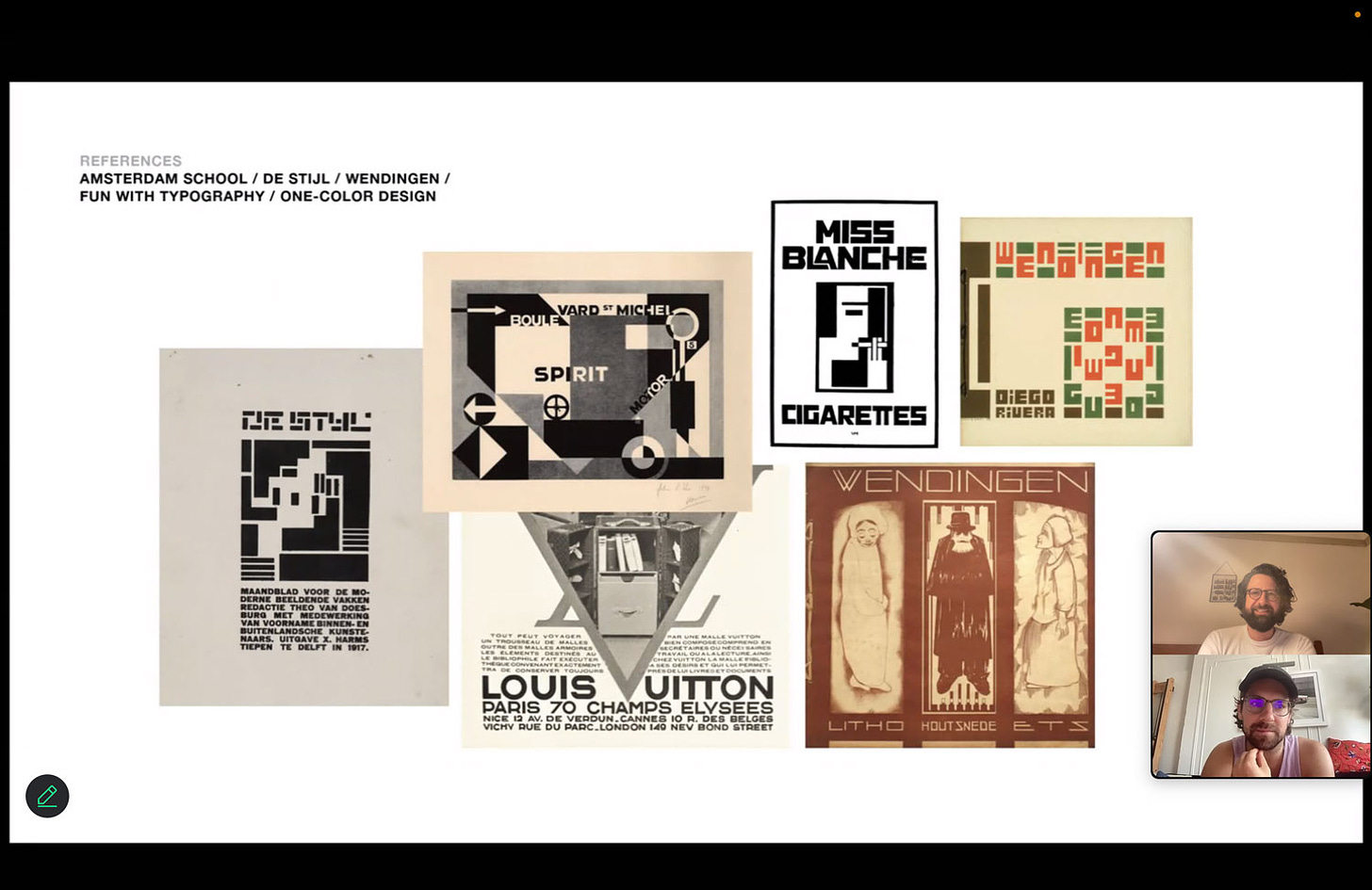
Reference the Amsterdam School of Design (1910-1930).
Deliverable:
One cover design, either the front panel only or utilizing the full gatefold.
I put a lot of thought and research into this brief. Months of work came before I could even start the writing process. My goal was to make sure I fully understood the message and theme of my book so I could clearly convey it in a way that would be useful for Maxwell.
Every element of this book has been carefully considered to help tell a story that is deeply personal to me. From the choice of paper, the color of the cover, the images, the type of printing, etc. The cover design is especially important, as it’s the first thing people see, and I want it to strike the right note, inspiring curiosity while beginning to communicate the message I want to share.
A thoughtful design brief sets the tone for your collaboration with the designer. Being clear and decisive in your thoughts, and communicating them well, helps prevent the confusion and frustration that can easily come up in creative projects. It requires quite a lot of thought up front, but it makes the life of your designer so much easier.
After The Brief
Last night, I had an amazing video call with Maxwell to review his first sketches, and I was thrilled with the direction he chose. I can’t wait to share it with you next week. For now, here’s a small glimpse—a screenshot from the Zoom call where Maxwell presented his inspiration, drawing from the Amsterdam School of Design, de Stijl, and the work of Vilmos Huszár.
This was step 9 in my series of how to make a photo book or zine. I hope you’ve found it helpful and inspiring to your own projects and getting the into print form, even if it’s just a few copies for yourself and your family and friends.
In case you’re new here, I’ve included all previous steps below.
How To Make A Book - In 15 Steps
Previous Steps:
Step 1 ☼ Finding The Right Concept to Build a Book Around
Step 2 ☼ How To Select and Organize Your Images
Step 3 ☼ How To Sequence Your Images and Build a Narrative
Step 4 ☼ Designing A Layout (As A Non-Designer)
Step 5 + 6 ☼ How To Make A Photo Book Dummy + Revise/Edit
Step 7 ☼ How To Write and Use Text In Your Photo Book or Zine
Step 8 ☼ How To Make Smart Design Choices For Your Photo Book
Step 9 ☼ How To Design A Book Cover
Upcoming Steps:
Step 10 — Choosing your printer and your materials
Step 11 — How to talk about and market your book
Step 12 — How to launch a preorder
Step 13 — Press coverage and partnerships
Step 14 — How to launch your photo book
Thank you for reading. Process is the result of collaborative creativity. It’s written by me and supported by you—whether you read, share, comment, buy my books, hire me for portraits or mentoring, or become a paid subscriber:
NEXT WEEK: I will share a preview of the actual book cover that came out of this process, talk about how I selected the printer, and I will reveal the preorder date of my upcoming photo book NOTICE Journal, Volume One!
Keep shooting and take good care of yourselves and others. <3
Wesley
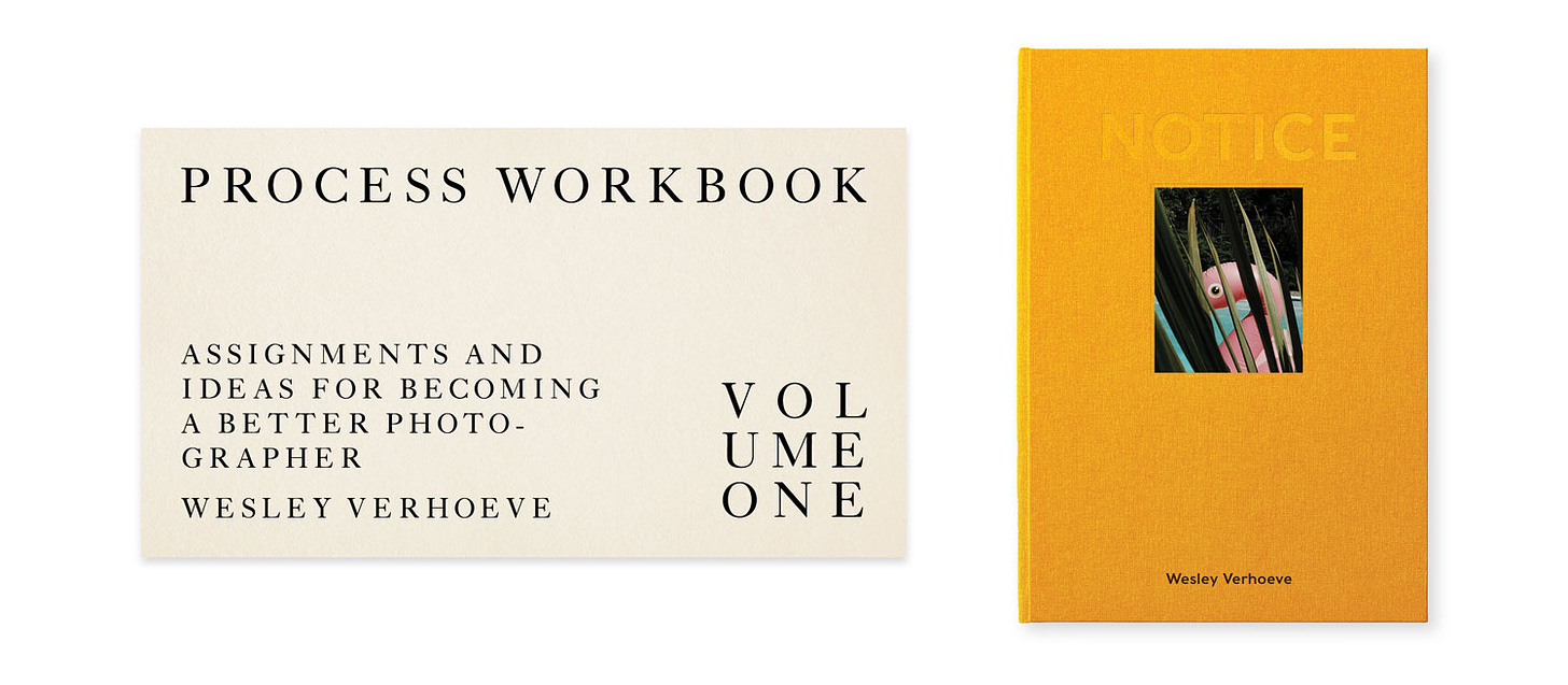
PS If you’d like to support what I do here, consider ordering the brand new Process Work Book (free for members, €8.99 for non-members) and my photo book "NOTICE" (€39 for members with use of their Process Photo Club coupon, €69 for non-members).
Gear & Tools Used
Camera: Hasselblad 500cm
Film Stocks: Kodak Portra 160NC, Kodak Tri-X
Shout out to MPB.com, my go-to place to buy, sell, and trade used cameras and lenses. I love their service and am a paying customer. MPB caters to over 625,000 visual storytellers and provides a 6-month warranty. Thanks for the support, MPB! <3
Lab: All my analog work is developed and scanned by my friends at Carmencita Film Lab. They’re my favorite lab in the world. Use code “PROCESS” to get a free upgrade.
Can’t get enough Process? Browse the Process Archives.
Visit the Process Photo Club members area for perks and more.


This is such good information, Wesley.
So much noise in the world, it is good to get some signal.
A master class in doing what needs to be done to create a photo book - any book, actually - the correct way.
Appreciated.
Yes! A good brief that balances direction and collaboration can do wonders for a project. I love your emphasis on it feeling like a conversation.
Thanks for writing!