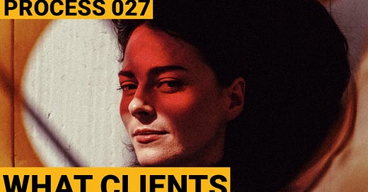
Process 027 ☼ Giving Clients What They Want + Showing Them What They Need
Giveaway: Sixteen Magazine
Dear friends,
Today’s letter is about giving photography clients what they know they want, but also showing them what they may not know they need. Is this a vague opening sentence? Mayhaps, my friends. Scroll down for clarity.
For this week’s giveaway we have three issues of Sixteen Journal, one of my favorite photography magazines around at the moment.
Give Your Client What They Want
The brief was straightforward. DJ and producer Nicky Elisabeth and her team were looking for two beautiful, simple portraits to use alongside a press release for her upcoming EP with Berlin-based electronic music label Kompakt Records.
One portrait would be a full body shot and the other a tighter shot that could serve as an artist portrait for festival and club websites when Nicky goes on tour.
We booked Studio 13, my favorite in Amsterdam, and hair and makeup artist Charlotte van Beusekom. Nicky created mood board with some of her favorite portraits in this simple and straight forward style and we chatted about the intended use to make sure we were on the same page.
On the day of the shoot we walked into the studio to gorgeous sunlight and got right to work. After Charlotte worked her magic we started shooting in the style we had discussed, capturing some beautiful portraits that would work well for press outreach.
My creative urge to go crazy with the bright sunlight and start experimenting had to momentarily be repressed. During a client shoot the most important thing is to create the work that the client is paying for. That is the job. What is not the job is you going crazy pursuing your artsy fartsy instincts. That’s what personal shoots are for.
Shooting for clients is a service business. It’s our job to pay attention, listen, ask questions, and do everything to get on the same page with the client about the goals of the shoot and how the final product will help them tell their story.
After we completed a set of color images and a set of black and whites I felt confident that we had covered the shots we needed to satisfy our creative brief. Since there was still studio time left this was the time to step away from the constraints of the brief and experiment with other styles to see where our creative instincts wanted to take us.
This is my goal with every client shoot. I call it my “one for you, one for me” rule. Whenever possible, and only after completing what the client asked for, I make sure to also create some work that pushes me creatively and reinterprets the assignment.
If the results of that work don’t quite work out then that is ok because we got our safe shots and that’s all the client expects. But when the reinterpretation works, we overdeliver by creating some unexpected magic.
Show Your Client What They Need
It didn’t take long to come up with some fresh ideas to experiment with since the bright sunlight was hitting the studio windows just right.
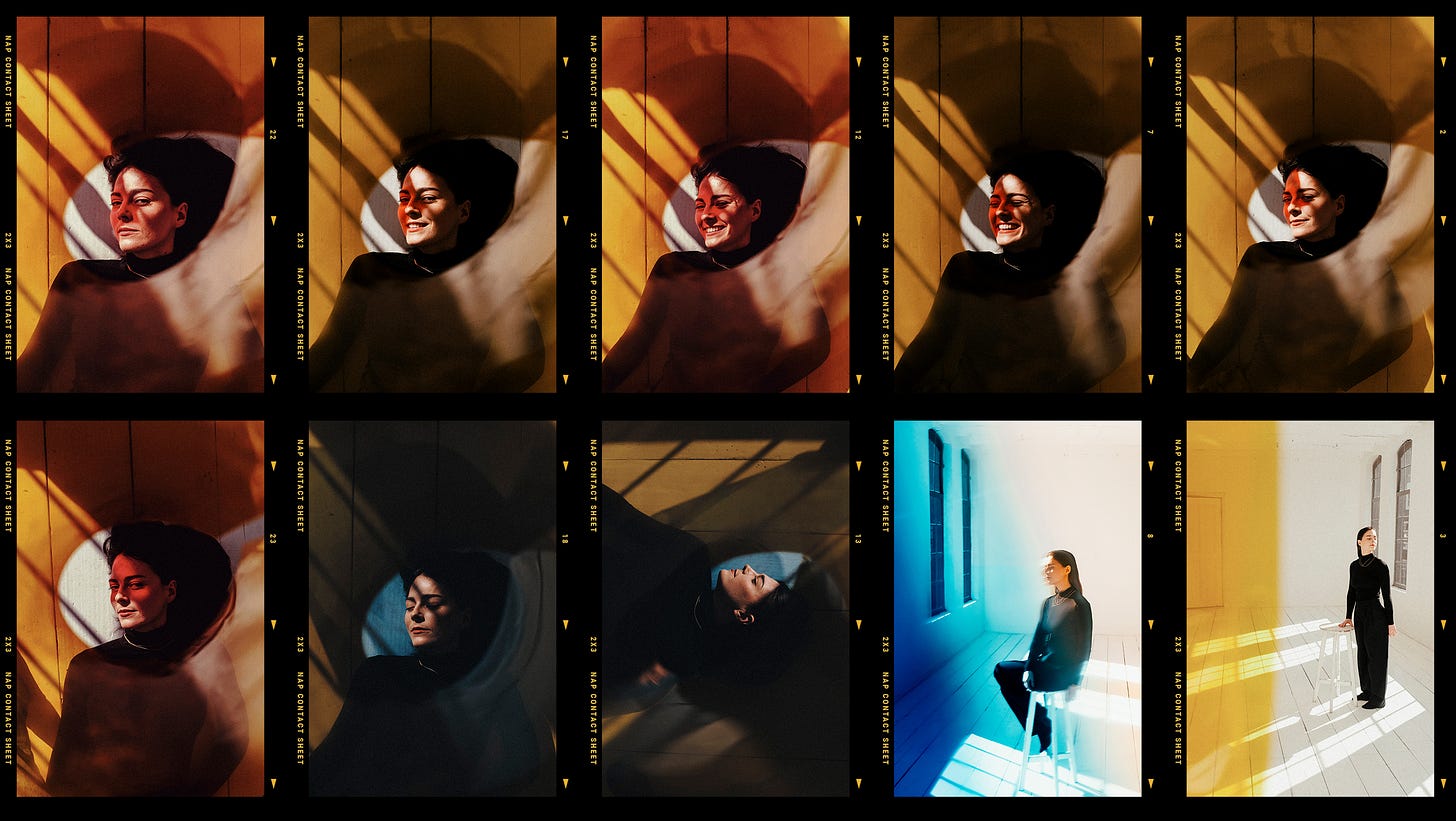
Since Nicky’s outfit was all black and the room was entirely white my first instinct was to introduce accent colors into the frame using light and gels.
First I framed Nicky inside of yellow light boxes to create a frame inside of a frame. Next I flipped this idea on its head and used the negative space created inside of the colors as a focus tunnel to highlight Nicky’s expression and emotions.
For the last two shots in the set above I switched up my composition and went full body. For the blue piece I decided on slowly fading the color by layering gels and light. For the yellow piece it became more of a solid barrier effectively locking Nicky into one side of the frame and creating some tension that way.
Our time was starting to run out but we managed to get one last set in. I wanted to shoot some tight portraits that I imagined as beautiful concert posters. When I composed these shots I considered leaving enough space so that a graphic designer would be able to include a logo and text to communicate all the important info.
The predominant color for the last set was red, for no other reason than that it popped into my head. Later Nicky mentioned red was also the color of the art for Celeste, the first single off of her new EP. Sometimes the universe works out like that. Lucky!
The Final Selection
Part of the reason that I apply the “one for you, one for me” rule is certainly the “for me” part. It’s a fun challenge to reinterpret an assignment and use that pressure to create something that pushes me creatively. But that’s not the only reason. The ideal outcome and secret goal is that it might benefit the client and their goals.
Sometimes we don’t know what we need until we see it. There is nothing more satisfying than surprising a client with work that inspires a complete change of visual direction and helps them stand out, which is what happened here.
The images that were true to the brief came out lovely and would have fit the team’s original plans perfectly. But once Nicky and her team saw the “for me” shots they quickly decided they preferred those and changed directions. Win-win!
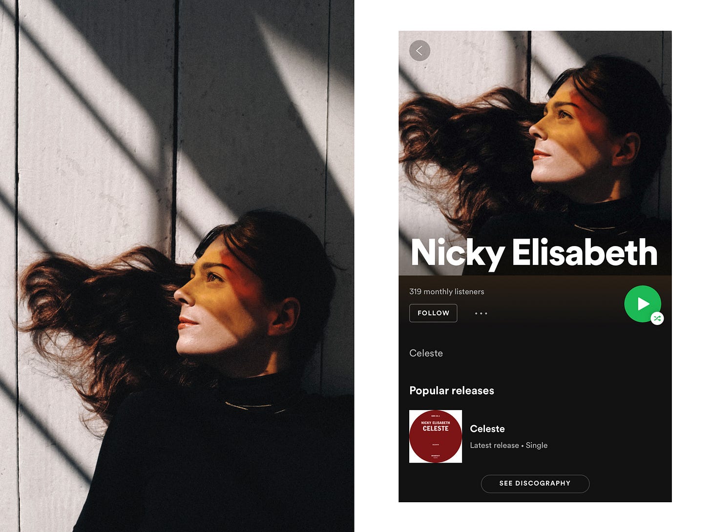
The two images above were selected for press and festival listings. A cropped version of a third image, see below, was turned into Nicky’s artist portrait on Spotify.
Another great shoot in the books and a good reminder that I really enjoy making work with and for musicians and record labels. Drop me a line if that’s you. I am currently booking March and April in Amsterdam and the rest of the Netherlands.
Notice Book Update
In just a few days the first official test prints will arrive, using the paper we selected for the book. We found the perfect cloth for our binding, in two gorgeous colors and with the perfect textural fit for the “Notice” body of work.
It turns out setting up an international mailing and payment system is kind of complex so our pre-order is still a week or two away. There’s lot of exciting pre-order related news that I can’t yet share but let’s just say those of you who buy “Notice” during the two-week pre-order period will be treated to some very special thingamabobs. Latecomers will miss out because you snooze you lose and all that.
Alright that’s it for this week!
Keep shooting and take good care of yourselves and others. I appreciate you.
Wesley
Process Giveaway!
I am a big fan of Sixteen, a bi-annual print magazine and digital platform about contemporary photography. This week we’re giving away the three beautiful issues below (1, 3, and 4) to one lucky Process reader.
To enter email me at hello@wesley.co (please don’t reply to this note but send a separate email) before 11pm EST on March 11th and answer the following question:
Who would be your dream musician to take a portrait of, and why? (My answer: Mos Def because his energy is soulful and I suspect he’d enjoy being different and getting creative.)
One winner will be randomly drawn and notified. This giveaway is for Process subscribers only. Subscribe by clicking the button below:
Make sure to show Sixteen Journal some love on Instagram and check out their site.
Would you like to support Process? Great! Tell your friends about it. Just click below:
If you’re a new reader, browse the Process archives here.
Process is a weekly letter from Wesley Verhoeve.
Follow along at @wesley.


Really cool photos. I have never used gels and am wondering how you get these in the frame? Some special lens filter system? Kind regards
These are amazing. Your process of starting simple, working toward weird/complex/personal, and having the client/subject end up liking the latter mirrors my experience too (though I rarely work with paying clients). I'm curious about a couple of things. Did you set out or agree to shoot exclusively (or nearly exclusively) in portrait orientation? And do you shoot both film and digital with clients?