Process 008 ☼ Three Photography Tips For Beginners (Plus Four More)
Giveaway: Rosie Matheson’s Boys Magazine
Dear Friends,
This week I’ll share the three pieces of advice that come up most often when I do portfolio reviews.
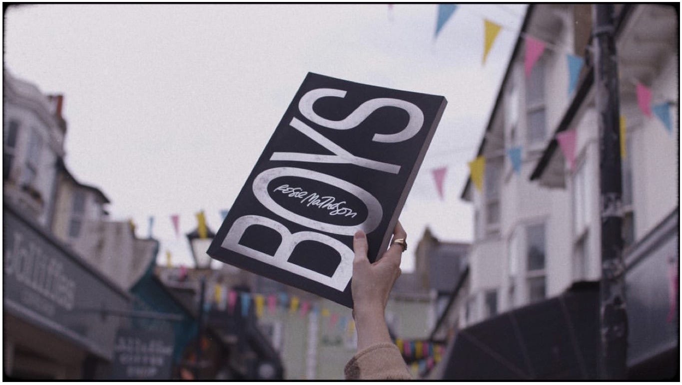
Also, we’re also giving away the very last copy of Rosie Matheson’s sold out and very gorgeous and massive Boys Magazine.
Three Pieces of Advice
One of the things I love most about photography is that there is always more to learn. As long as you stay curious and dedicated, there will be opportunity to improve forever. Photography is a never-ending craft.
Portfolio reviews are a great way to improve. Photographers whose work you admire can share technical insights and process tips, but don’t only show your work to other photographers.
Watching non-photographers view your work can bring valuable insight unburdened by any photography training. Sometimes that’s even more valuable. In the end that’s who you want to move with your work after all.
With every round of feedback we gain little bits of awareness that will help us see differently, document more elegantly, and tell better stories.
Below are the three pieces of feedback that come up most often when I hold portfolio reviews. Italian photographer and Process reader Lorenzo Martinoia’s was kind enough to let me share some of his work and the comments from our review session.
1. Everything Is A Portrait
Decide which part of the image is your main subject before pushing your shutter button. The viewer should know right away what they’re supposed to look at. Your composition should lead their eyes to the most important part of the photo.
If it’s a portrait of a person, that’s easy, the viewer will usually be led to the eyes or face. If it’s a cityscape or a still life, you can still think of the image as a portrait. Just not of a human.
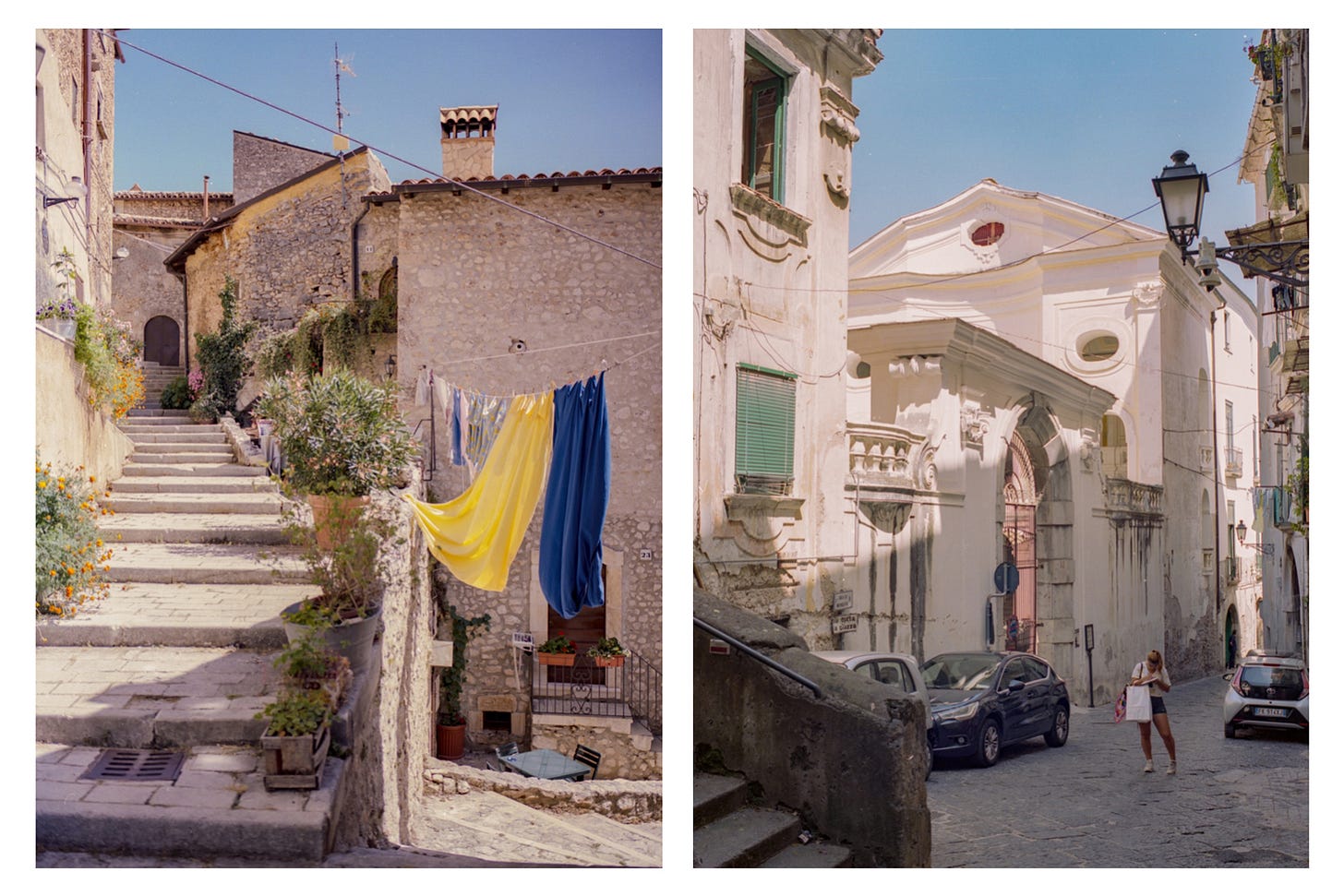
For example, in Lorenzo’s photo on the left notice the leading lines that take us by the hand and bring our eyes to the door in the back. The colorful laundry is a secondary subject whose lines also lead us to the door. It’s a beautiful clear image that would be lovely in a travel piece. This photo works as a portrait of a charming street scene.
On the right side however, my eyes feel nervous as they search for a subject to land on. Is it a portrait of the woman? Well, she’s in the shade and her face is turned away. Our eyes generally follow the light, which means we land on the top half of the building in the center. So is that our subject? Hmm just not very clear and therefor a less strong image. Not a portrait of anything really.
2. Watch Your Lines
Unless you’re intentionally going for a chaotic feel or lots of tension, try to compose for calmness and watch your lines.
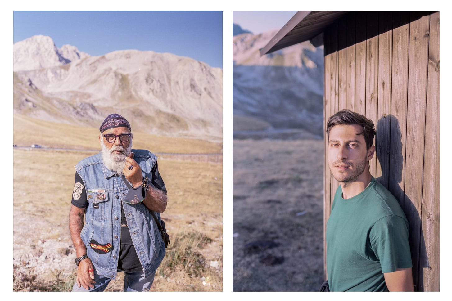
For our example, let’s look at the image on the left, which has a very simple composition. Some photographers may crop in further, which is a valid choice, but it is a balanced, pleasing, and beautifully metered image, requiring no extra work from our eyes.
In the image on the right, we can sense some unease in the composition. You may not be aware why that is right away but the edge of the wall competes with our subject’s face because they’re too close together. This causes visual tension. If Lorenzo had taken one step to his left and re-composed this portrait by framing his subject with more of the wall to the subject’s right it would have created a calmer composition.
3. Consider Figure-Ground Separation
Sticking with the previous image on the right, notice that our subject’s skin and the wall behind him are so similar in color that they blend together. This increases visual tension due to a lack of separation between our subject and the background.
Warning, we’re about to get real nerdy.
In Gestalt psychology there is a concept called principles of grouping and the related idea of figure-ground separation. Wait, suddenly we’re talking psychology? Wasn’t this a newsletter about photography? It’s all related!
Separation: An object isolated from everything else in a visual scene is more likely to be seen as a figure versus background. (source)
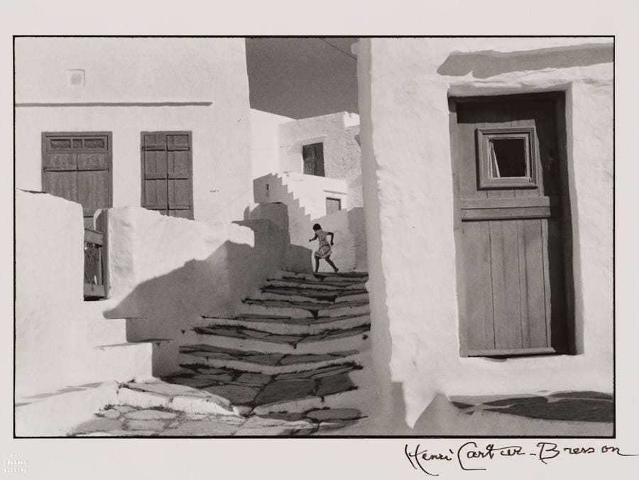
Now what does that mean exactly? Let me illustrate with an image by master photographer Henri-Cartier Bresson:
This photograph perfectly illustrates the power of composition and the importance of separating our subject (figure) from their surroundings (ground). Our eyes immediately notice the running child. Her dark silhouette is framed by the light greys of her immediate surroundings, which in turn are surrounded by a ring of bright white structures. So much separation between the different layers in this photo means it’s easy our brain to process what is happening in a split second. This photo takes my breath away.
Bonus Tips
Read more photo books than gear reviews — GAS (gear acquisition syndrome) is real and very distracting. We learn much more from looking at photo books. If you’re looking for more photo books to discover, my friend Paul Jun and I have built a website for you: The Observers. (Re-design and season 3 coming shortly!)
Shoot for you, not for likes — We’re all on social media hoping that our friends (and strangers) will like our work, but it’s an unsustainable way of creating. Try not posting work right away and sit on it for a bit to form your own opinion first before asking the world.
Limit yourself — Don’t get a new lens until you feel confident you’re fully in command of the one you already have. My entire project One of Many was shot on one lens. Over 600 environmental portraits, one 35mm lens.
Give yourself a project — Rather than picking up your camera and randomly shooting images, try organizing your thoughts and shooting a specific project. It will force you to hone in on a style, which is be a great way to get better at it. Looking back at a project will also be more meaningful later on, especially if you turn it into an eBook or a printed zine, even if it’s just for yourself.
Alright, that’s it for this week. Get out there and shoot this week!
Dazzled in Amsterdam,
Wesley
Process Giveaway!
Rosie Matheson is a friend and an inspiration. She released a gorgeous and massive magazine centered around her Boys series, exploring the nuanced nature of modern masculinity.
The Boys Magazine quickly sold out but there is one single copy left. Can you believe it? Only one copy left?? I could sell it for beaucoup dollars on eBay but no, I will give it to one of you dear readers. Because I love you.
To enter this giveaway hit reply or email me at hello@wesley.co and answer the following question:
What is your favorite music album to listen to while shooting or editing photos, and why?
This giveaway is for Process subscribers only and can entered until October 7th, 11pm EST. One winner will be randomly drawn and notified by email.
Congrats to last week’s winner: Austin Tuna who won a beautiful Nikon FA camera, courtesy of Camera Center of York.
Browse the Process archives here.
Process is a weekly letter from Wesley Verhoeve, who you can also follow at @wesley.
As always, I appreciate you sharing this newsletter with your friends. It means a lot.


