Process 075 ☼ How I Built My New Portfolio Website
GIVEAWAY: Long Weekend bag + film + online Moment course
Dear friends,
This week’s letter marks the launch of my brand new portfolio website and the process of how it came about.
Also, holy mackrel this is Process issue 075! Thank you to everyone who has been here from the beginning and everyone else who joined the ride since then. For those of you who have joined later, you can find all previous issues in the archives.
If you have friends who you think would enjoy Process, do me a favor and share away!
This week’s PROCESS GIVEAWAY is a great prize back including 5 rolls of film, a Long Weekend bag, and an online course from my friends at Moment.
Housekeeping
In issue Process 074 I shared a behind-the-scenes look from a press photo shoot with documentary directors Juul Op den Kamp and Johan Fretz. Since then various images ran in several magazines and newspapers including NRC and Telegraaf, see below.
Updating My Portfolio, The Hard Way
Way back in Process 002 I explained the step-by-step process of creating a portfolio. Later, in Process 060 I shared how to pitch your photography and use your portfolio to generate client work or press for your projects. Today is about a necessary follow up.
For the past few weeks I’ve been working on a refresh for my portfolio as well as a new way to present my work by redesigning of my website. Let’s start with the former.
The normal person way of updating a portfolio is to replace a few older images with some new ones that are better and the re-sequence it and be done. The Wesley way of updating a portfolio is to add some new images and look at the old images that are staying and insisting on doing a completely new edit from the negative or raw file since I’ve learned a lot in the past few years and also I’m a maniac.
For example, on the left we have the 2016 edit of a David Coggins portrait, taken for a client shoot for razor brand Harry’s. On the right is the 2022 edit, which is warmer in tone and wider in composition and creates a calmer feeling for the viewer. Is this a drastic improvement worth the time I spent on it? TBD, but I can’t help myself.
After I re-edited dozens of images and collected a bunch of new portfolio pieces it was time to build a home for all these photos.
Building A New Website
In many ways social media has taken over as the first destination photo editors and potential clients go to when considering which photographer to hire. That being said, having a proper online portfolio website still comes with many benefits, not in the least having full control of the way in which you present your work, and the fact that there is more space for bigger images and more information.
One of the reasons I really needed to re-design my website is that in the past few years my chosen profession has expanded and grown to include different kinds of photography and related activities like teaching workshops, mentoring, and more. My old website simply didn’t have the infrastructure to include it all in a clear way.
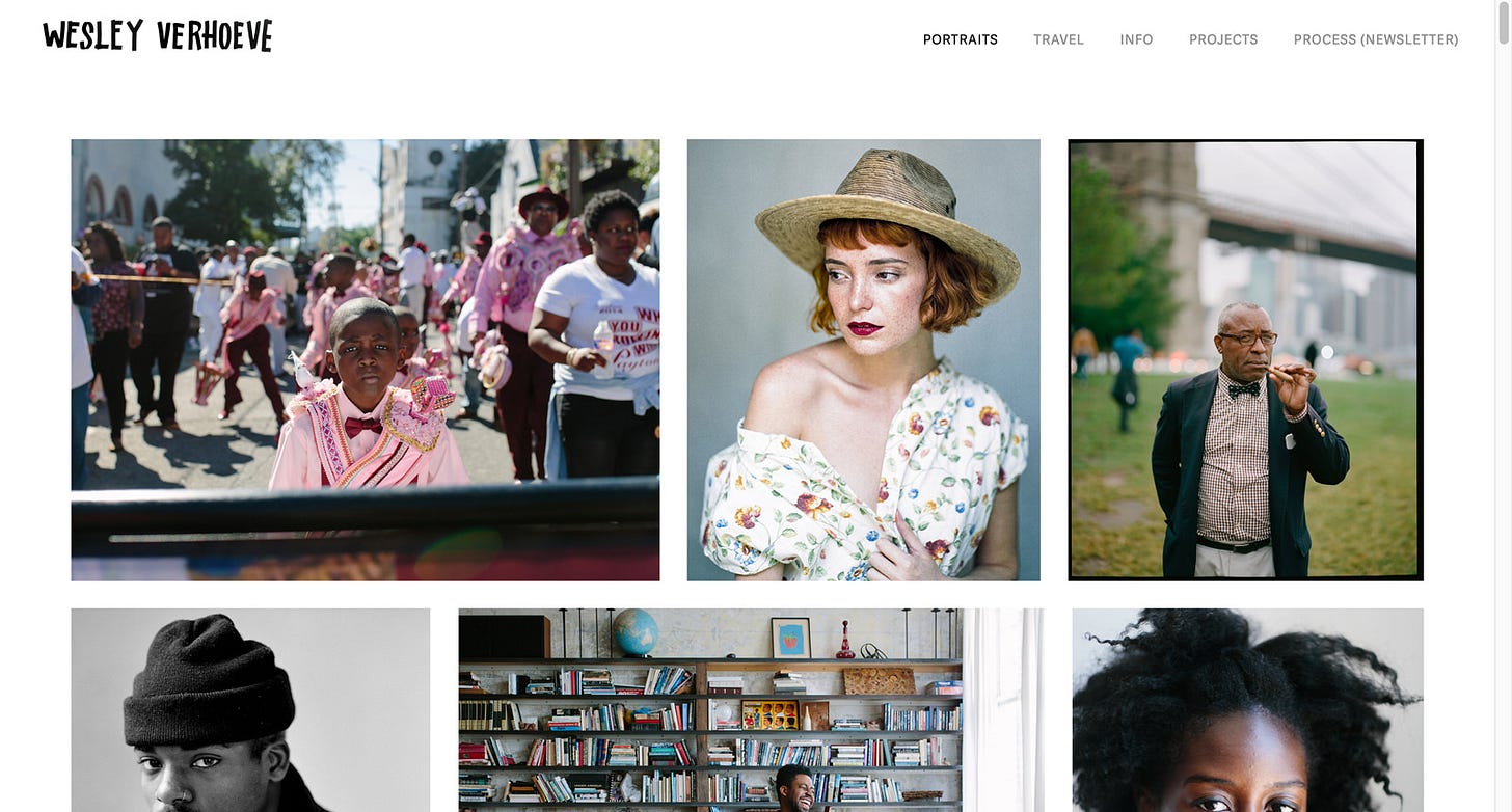
A reminder of what my website looked like for the past few years:
It was an effective but not particularly exciting Squarespace portfolio website that centered images and did the job. I was able to build and update it myself which was a very important part of the appeal as well.
I knew to take the next step of having a website that better represented my work I needed some professional help. Enter Samuli Jokinen, Finnish designer, master of the gif reaction, and builder of websites. Samuli and I have been working together for the past few weeks and I couldn’t be happier with the resulting website and friendship.
I mean look at us, sometimes we even wear matching sweaters and re-enact classic 90’s Christmas movie scenes together on Zoom.
Our initial creative brainstorms honed in on three key elements for the new website.
A New Visual Direction
The keyword here was bold. I wanted a less standard and less timid feel for the website. We also decided to bring together the visual branding of Process and Notice by using the same yellow color for accents and framing. We chose a font that had more personality and presence. This is what the new home page looks like, see below.
The home page continues below the fold when scrolling down, but this is the first visual that meets the visitor. It includes the new color, a cleaner and simpler menu, a carousel of various representative images, a simple description, and the bold font. It’s still built on Squarespace, which has upgraded a lot of their underlying tools recently.
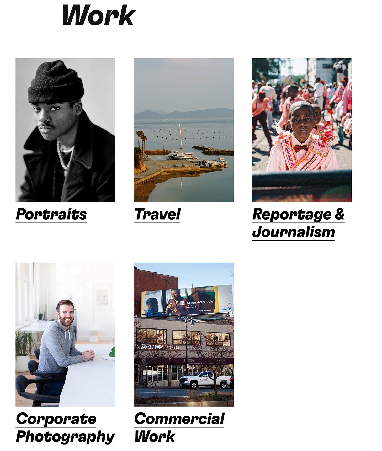
If the visitor of the home page is a potential client they will probably click to the work page next, which looks like this:
I’m very excited about having a more clear and complete way to present the various aspects of my work, including some of the bread and butter which I haven’t gotten a chance to talk about much yet here in Process: corporate and commercial work.
There is now also a clear and clean secondary menu in the footer that has more detail.
I love that there is now a dedicated section for my mentoring, workshops and Process.
The other section I am thrilled about having is Reportage & Photojournalism, which allows to me to share larger sets of images and will be a great tool for Process as well.
The above screenshot show six sets within Reportage & Photography section, but there’s already eight and it will keep expanding with projects new and old over time.
There’s a lot more to the website and I invite you to go check it out for yourself over at the brand new and delicious: Wesley.co
This coming week I will reach out to my favorite past clients and share this new portfolio to see if we can work together again. Since most of my clients are still US-based I’m going to dedicate a fair bit of time to research companies and organizations in the Netherlands, Germany, and the UK who have photographic needs I can help with, especially for corporate and commercial campaigns.
Referral Reward
If you work for a company that needs photography and you connect me, there will be a special reward for any successful referral. Any tips are welcome, especially tech startups with an office in Amsterdam and any company that wants to distinguish themselves by way of quality photography for their staff portraits and marketing. Just reply to this letter or email me.
That’s it for this week! I’d love to hear from you with any bugs, typos, or unclear things you might come across. I’m a tinkerer so I will continue to work on the website.
Major shout out and thank you to Samuli for being such a pleasure to work with on this website. If any of you are in need of design and development work for your website I can wholeheartedly recommend working with him. Check out his work here.
Next week: I am sharing a brand new portfolio that I shot in Mexico City at a famous skate park, plus I will introduce you to a new member of the Process team.
Keep shooting and take good care of yourselves and others.
Wesley
PS Shout out to Sarah Wells and Dan Rubin for taking a good look at the website pre-launch to help us find some of the bugs and necessary tweaks.
Process Giveaway!
My pals over at Moment are back for a wonderful giveaway! One winner will receive five rolls of film of your choice, one Long Weekend bag, and one online course from the Moment store. What? Yes! That’s a lot of goodies, all from Moment’s wonderful online shop where you can find all things photography from film to cameras and more.
To enter this Giveaway visit the Process Flip page and answer this question:
The New York Times calls. Your assignment is to take portraits of the most interesting person in your life. Who are they and why would you pick them?
It can be anyone from a family member, or your local librarian, or a local sports star.
ENTER THIS WEEK’S GIVEAWAY HERE before 11pm EST on October 1st.
The winner will be randomly drawn and notified. This giveaway is for Process subscribers only. Subscribe by clicking the button below:
Major shout out to the team over at Flip for partnering with Process.
Did you enjoy this issue? Share it with a friend who might love it too.
The best way to support Process is to order my photo book NOTICE.
Can’t get enough? Browse the Process Archives.
Find me on Glass / LinkedIn / Instagram / Twitter / Pocket / YouTube


It’s so nice!
The new website looks awesome!! Reminds me that I've been wanting to rework mine for a long time... gotta make the time and finally do it!!